No products match your search.
Unusual kitchen colours – tips, ideas and inspiration
Written by Andrew Nixon

Fancy something a little different? Blacks, yellows, purples, even pinks can all be stunning colours in a kitchen design – if you know what you’re doing. Here’s an expert guide to the how, why and where of unusual kitchen colours…
Well-designed kitchens can look amazing in any colour – and however adventurous your tastes are, there really are no limits to what you can do except your own imagination. However, if interesting colour is your thing – or if you have a particular favourite colour you’re dying to introduce to the kitchen – there are a few questions to ask yourself before you get the paintbrush out…
1) Monochrome or multi-coloured?
Contrary to popular belief, ‘monochrome’ doesn’t actually mean black-and-white, but rather ‘single colour’. Most monochrome kitchens are a neutral colour, most likely white – but a monochrome kitchen could equally be all green or blue or purple… or any colour. Single colour kitchens can work brilliantly, but if it’s an unusual colour they’re a very bold and potentially controversial choice. More often, you’d introduce the more out-there colours as part of a scheme that combines several different tones…
2) How much colour do I want in my scheme?
The classic interior design approach to combining colours in a balanced way is to follow the ‘60:30:10 rule’. The concept is to choose three colours and use them in a 60:30:10 ratio, with a dominant main colour, a secondary colour, and a third accent colour. So in a kitchen, the 60% area might be the flooring, the ceiling and the worktops; the secondary areas (30%) might be the cabinets, painted walls or large appliances; and the final 10% might be composed of handles, splashbacks, tiles or smaller accessories.
Thinking about colour in that way will help you decide how you might want to introduce an unusual colour. Do you want it to be the dominant colour in the room, or would you prefer to combine it with a complementary colour – or just have a few pops that stand out in an otherwise neutral scheme?
Some ways you can bring in different colours include:
- Painted walls (and ceiling) – perhaps with floating shelves painted in the same colour
- Flooring – tiles in particular give you plenty of options for colour
- Cabinet doors and drawers – these can be custom painted in any shade
- Glazed cabinet interiors – a more subtle alternative is to go for painted cabinet interior with glazed doors
- Worktops – these can be neutral, they can match the cabinets, or you can go for something contrasting and bold
- Kitchen islands – if the cabinets in an island are different to the rest of the kitchen it can create a striking focal point for the room
- Splashbacks and appliances – tiled splashbacks, fridges and other appliances can be chosen for colour pops in a kitchen
- Lighting – pendant and wall light shades are good for adding accent colours (see more clever kitchen lighting ideas here).
- Crockery and accessories – choose items for their colour and display them on open shelves.
3) Is an unusual colour right for my space?
Colour is strongly associated with mood, so when choosing an unusual colour, remember that it can have a big impact on the atmosphere in your kitchen. Colours that are close to the blue spectrum, including greens and purples, tend to feel cooler and have a calming effect, while those towards the red spectrum like pinks and yellows tend to feel warmer and more energetic.
It’s also worth thinking about the space you have available and how much natural daylight you have. For example, small kitchens tend to benefit from lighter colour schemes to make them feel more airy and expansive.
You can read all about these ideas in this post: Choosing colours for your kitchen – an expert guide.
So much for the general theory – now, on to the colours!
Yellow and gold

Yellow is the colour most associated with happiness – think sunflowers, daffodils and summer sunshine – so if it’s a mood-booster for you then a little yellow in the kitchen can make a big impact. Cabinet doors in a strong yellow or mustard colour can be stunning – giving you a massive, sunny hit of dopamine every time you walk in the kitchen.
Yellows always work very well with blues, as they’re complementary colours, directly opposite each other on the colour wheel.
Another clever approach is to bring in golds, honeys and ochres as accent colours through tiles, crockery, accessories or splashbacks – as in the Hampton kitchen splashback (below)with its gorgeous brass, bronze and copper tones.
See more yellow kitchen ideas here.
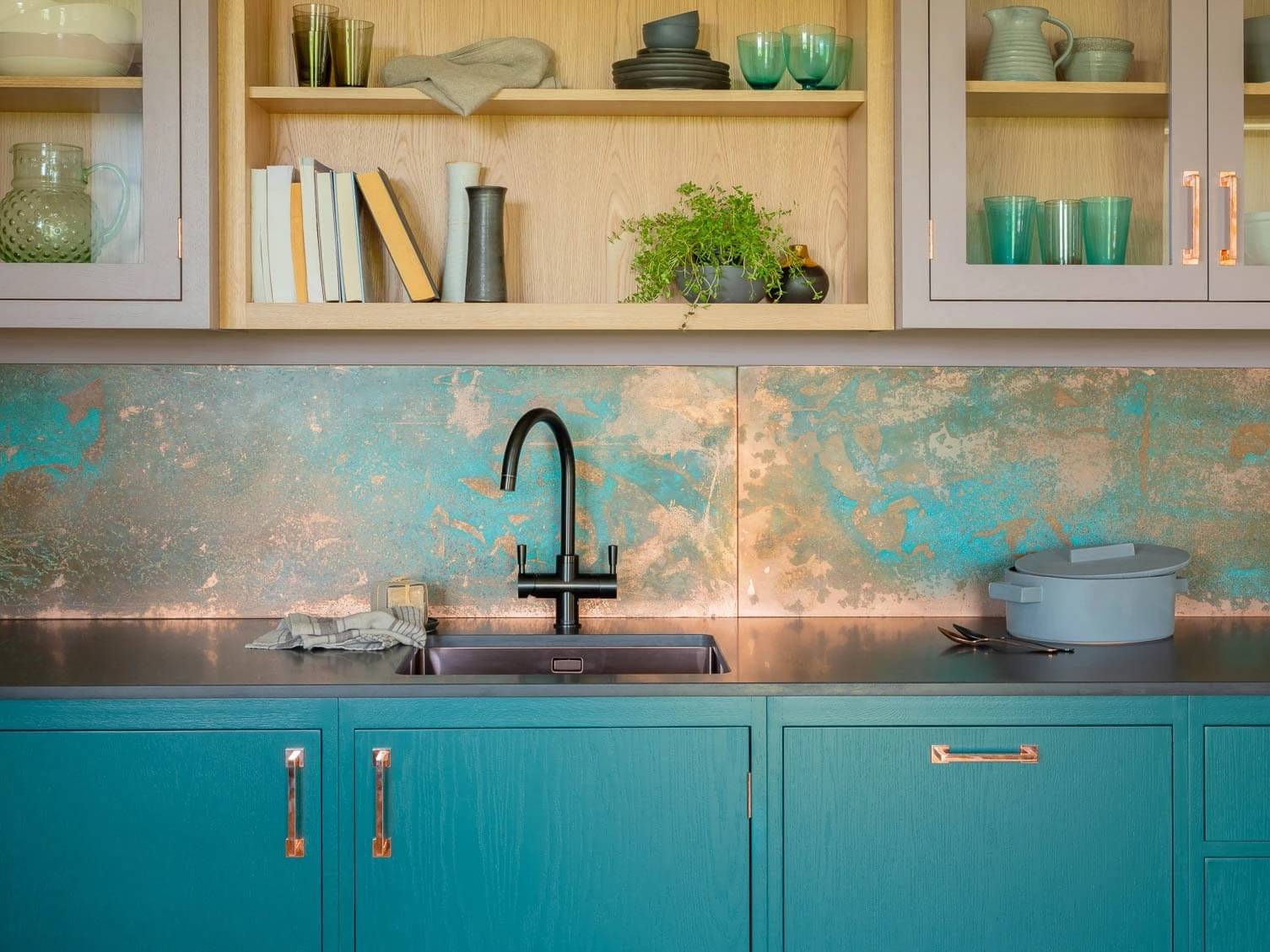
Turquoise and cyan

The lovely colours that sit between blue and green on the colour wheel have a long history of decorative use (turquoise is named after the mineral, much-prized for making jewellery since the days of Ancient Egyptians). They’re naturally cool colours, so in a kitchen they can have a calming effect.
When it’s used as the main colour in an otherwise neutral scheme, turquoise is bold but not overwhelming, so combining it with a white is a great way to bring out the colour’s rich blue-green character. It’s also a fabulous accent colour: in the Chepstow Villas kitchen (below) the interiors of the glazed doors are painted in turquoise, providing visual variety and depth.

See more turquoise and cyan kitchen inspiration here.
Purple

Associated with emperors and kings, purple conveys a sense of opulence and luxury, especially when combined with brass fittings (see the Houghton kitchen above - a positive symphony of purples and purplish shades).
More often it might be used as a contrasting accent colour – the deepest, darkest hue in an otherwise light scheme.

In the Albert Bridge kitchen, wall cabinets in Bramble purple provide contrast with the soft pinks and timber colours
See more purple kitchens here.
Pink
<figure<

Forget Barbie, pink is actually a very versatile and sophisticated colour – think dusky roses and warm terracottas. The Harpley kitchen’s look (above and top) is brought together by the sensational tiled splashback in multiple shades of pink.
You can even use it as a neutral: a pale pink is a lively, energetic alternative to a white as a wall colour - flattering blues and other colours without overwhelming them.

The Long Acre kitchen uses pink walls as an alternative to a neutral for the scheme’s base colour
See more pink kitchen ideas here.
Black

Black goes with absolutely any colour – so it's not unusual to have a few black appliances and features in a kitchen. As a secondary colour, black is a shortcut to smartness: as shown in the Cranbrook kitchen (above), with the black island and larder providing balance to the natural oak finishes of the cabinets and shelves.
But black can also be remarkably beautiful as a dominant colour. In the Ryburgh kitchen (below), cabinet doors in Oyster Catcher black are paired with floor-to-ceiling Oak Black Core cabinets, and the theme is continued with black walls and a chalkboard splashback – a very cool, very contemporary stunner!

See more black kitchen ideas here. At Naked Kitchens we’re serious about paint colours. Our own palette of Naked Colours is inspired by the skies, coastline and countryside of North Norfolk, and we offer a bespoke colour matching service to achieve literally any look you want, however unusual the choice. We also have an exceptionally efficient sprayline to ensure a durable, flawless finish. Get started on creating your dream kitchen today. See also: Choosing colours for your kitchen – an expert guide Green kitchen ideas and inspiration Blue kitchen ideas and inspiration What is a bespoke kitchen?
Request a Brochure
To receive a digital copy of our brochure and regular updates from us, please complete your details below.