No products match your search.
How to Choose a Color Scheme for Your Kitchen
Written by Andrew Nixon
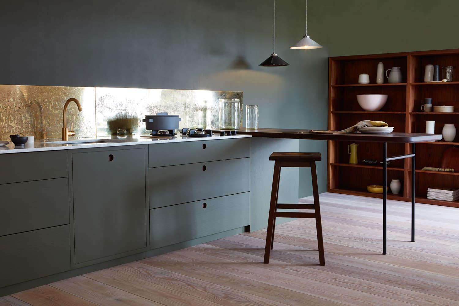
Dazzling or subtle? Neutral or bold? Monochrome or multi-colored? Choosing colors for your kitchen is a mixture of science and art – and there’s a surprising amount to think about. This expert guide will take you through the steps to find your perfect kitchen color scheme…The kitchen is where life happens: cooking and eating, working and playing. It’s the room that has to do everything, from quiet me-time breakfasts to elegant dinner parties to impromptu family discos. So how the kitchen looks and feels plays a huge role in your life…And absolutely critical to the look and feel of your kitchen is the color scheme you choose for it.Picking and combining colors is a great opportunity to express your personality and sense of style, to make a design statement and to set the tone for your entire home. This guide walks you through the key color decisions you’ll need to make and the mistakes to avoid, as well as giving you plenty of tips and ideas for creating the beautiful, stylish kitchen you’ve always dreamt about.
Planning a kitchen color scheme – the basics
Before you launch into color wheels and pantone references, there are some key questions to ask yourself…
- What kind of style and mood do you want in your kitchen? Are you looking for a traditional style or a smart contemporary vibe? Cosy and warm, or cool and sleek? The choice of color to a very large extent determines the mood and atmosphere of your kitchen, so think about the way you use your kitchen, who uses it, and how you want them to feel.
- What is the size and layout of the kitchen space? The right color scheme can really help make the most of your existing space, including making smaller kitchens feel larger (see below)
- How is the light in the kitchen? Do you have plenty of natural light, in which case colors will be truer and you can afford more dark hues, or are you reliant on artificial light, in which case you may want to emphasise brighter tones?
- How likely are you to change your mind? If you’re the kind of person who likes to keep changing things up in your decor, you may want to go for neutrals on the big, expensive elements of the kitchen (cabinets, worktops flooring etc) and save bolder color splashes for easily-changeable areas like painted walls or smaller accessories.
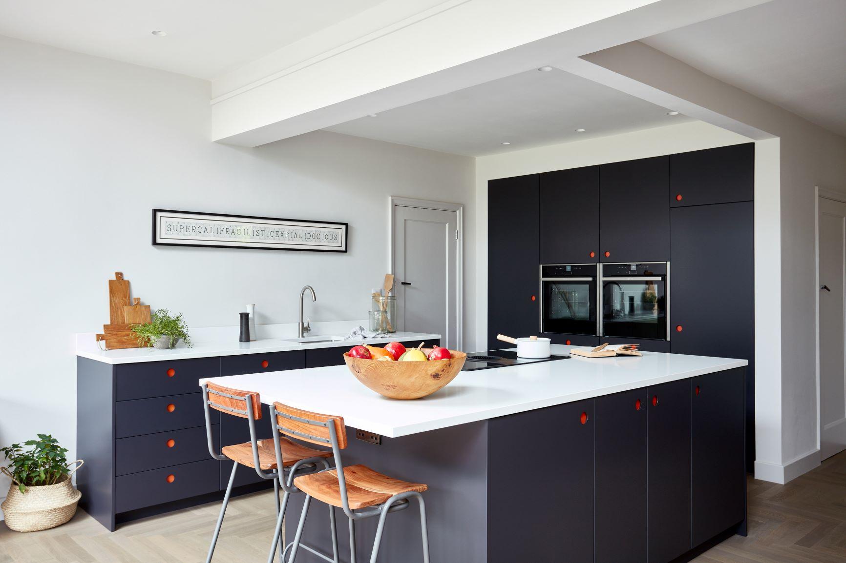
Naked Kitchens’ Ladbroke cabinets mixing the red of Morston Sails with dark blue in this contrasting kitchenColors and mood
Different colors are associated with different moods, and you can use your color scheme to create the right atmosphere in your kitchen.As a general guide, neutral tones and soft pastels create a calming atmosphere, making the space feel relaxed and welcoming.Colors that are close to the blue spectrum, such as greens, blues and purples, are known to be cooler and have a soothing effect – and that applies even to dark hues such as navy. Green can be a lovely natural, restful color for a kitchen, perfect for creating a relaxing space, while light blues and soft greys also have a calming effect.Colors that are close to the red spectrum, including reds, pinks, oranges and yellows are considered to be warmer and more stimulating. Bold vibrant reds can make a real statement in a kitchen, offering a sense of fun and energy, while a yellow theme creates a bright, cheerful feel.
White and monochrome kitchens
One option for a kitchen is to go monochrome. ‘Monochrome’ doesn’t actually mean black-and-white (a popular misconception) but rather a single color. So a monochrome kitchen can be pink or yellow or anything else.However, by far the most popular monochrome color for a kitchen is white. White is clean, minimalist, timeless and perfect for calming, Scandi-style kitchens.
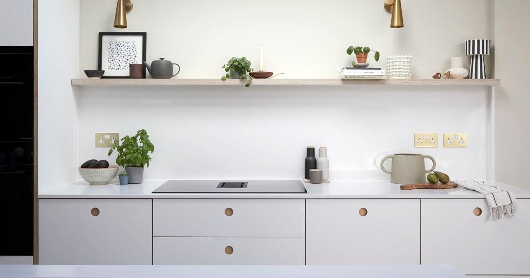
Ladbroke kitchen by Naked Kitchens for Emily Mayne of @somedaydesigns.co.uk. Photographer Anna Stathaki @annastathakiphoto
Of course, there are actually many different shades of ‘white’, from pure bright whites to cool ivories, warm creams, light greys and greige. And you can add warmth and visual variety to a white kitchen by using exposed wooden worktops and some hardwood flooring in a darker shade, or alternatively introduce a pop of color via splashbacks, appliances, furnishings or plants.But a monochrome kitchen isn’t for everybody. For most people, designing a kitchen means combining colors….
How to combine colors in a kitchen
Choosing colors may seem frighteningly open-ended, with an infinity of choices to wrestle with. However, there are some well-established color principles that can guide you and help you to create a beautiful, balanced look for your kitchen.
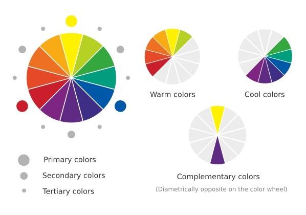
- Tonal colors – use different tones of a single color for a harmonious feel
- Analogous colors – use colors that are close together on the color wheel for a calm, relaxing feel. Examples would be using greens, blue-green and blues.
- Complementary colors – using colors that sit at opposite ends of the color wheel, which complement each other but provide contrast for a bolder statement. Classic complementary color combinations include blue-orange,blue-yellow, red-green and yellow-purple.
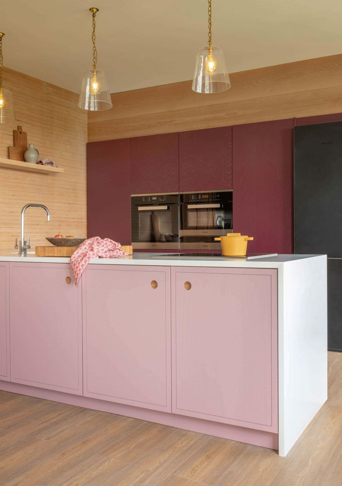
Analogous colors: Naked Kitchens’ Meadow Thistle (island cabinets) and Bramble colors (wall cabinets) in beautiful harmony in this Albert Bridge kitchen
Using three colors: the 60:30:10 rule
In general, it's best to avoid using too many colors. Instead, focus on carefully choosing a few colors that work together to create the look and mood that you want to achieve.
There is a long-established rule of thumb in interior design for creating a balanced look in a room. The idea is that you choose three colors and use them in an approximate ratio of 60:30:10. So 60% of the room is one color, 30% is a complementary second color and the remaining 10% is a bolder accent color, which gives the scheme depth and interest.
If you look at beautiful interior design accounts on Instagram you’ll see this happening over and again. In sitting rooms, for example, the 60% color might be a neutral for walls, ceiling and perhaps a sofa; the secondary 30% color might be the rugs and curtains; while the final 10% might be color ‘pops’ from lampshades, artworks or cushions.
So when designing your kitchen, think about how the visual space in the room is made up, and mix and match colors in proportion accordingly. Start with the big areas first and then coordinate the other elements. This will be different for every space, but a typical breakdown might be:
- The biggest area (the 60%) might be the flooring, the ceiling and the worktops
- The secondary areas (30%) might be the cabinets, painted walls or large appliances
- The smaller tertiary things (10%) might be splashbacks, tiled sections or smaller accessories.
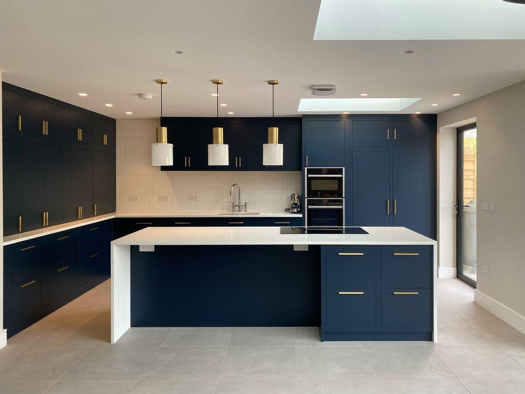
In this classic, balanced kitchen design, approximately 60% of the color is white/neutral (ceiling, floor, walls, worktops), while the blue cabinets make up is the secondary 30% color; and the final 10% tertiary color is the bronze of the cabinet handles and pendant lights.
Ultimately, however, color and design are matters of personal taste, and for every interior design ‘rule’ you can mention you can also find a talented person on Instagram brilliantly breaking it!
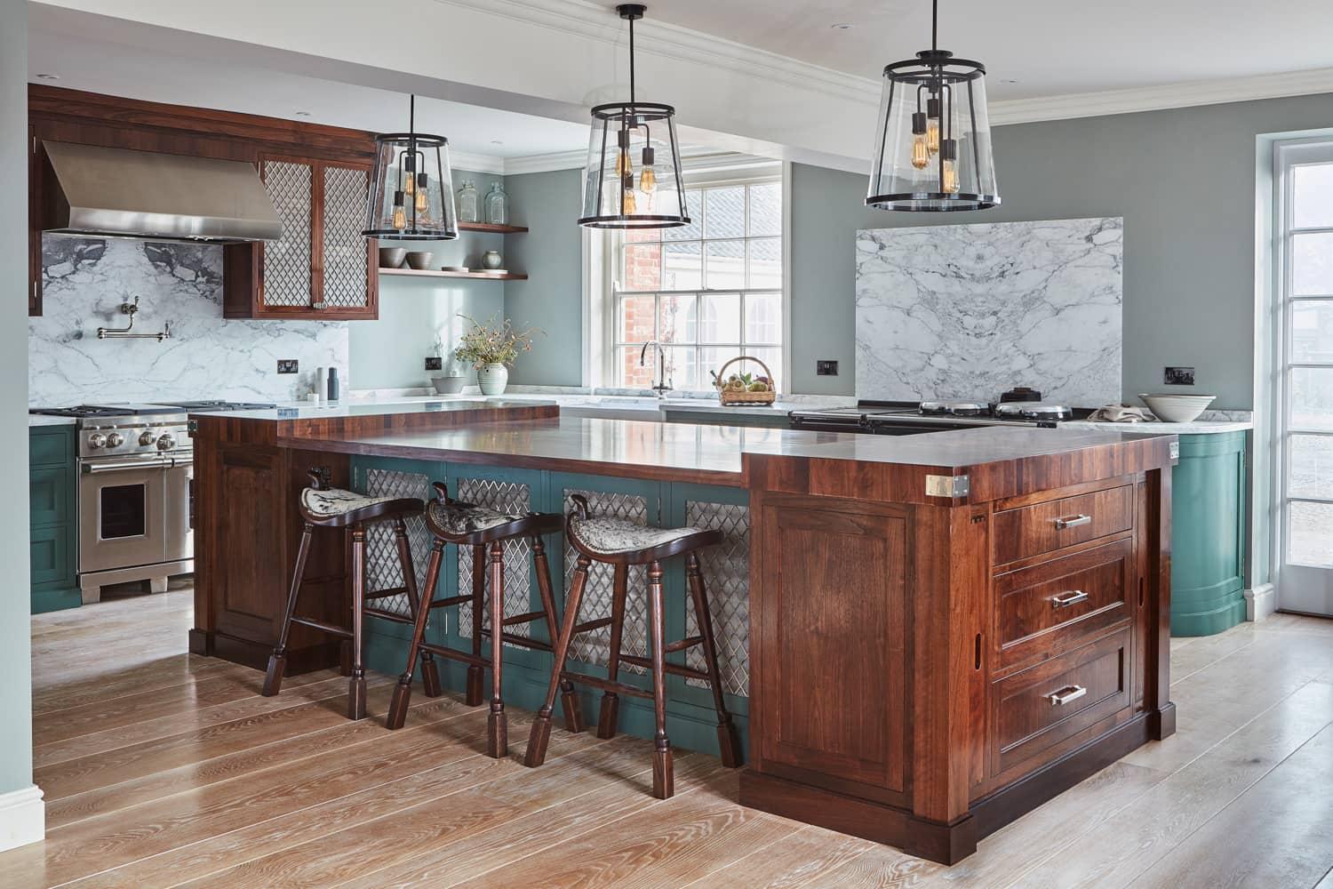
Breaking the rules: the Georgian Hall kitchen uses walnut (worktops and island cabinets), Marsh Green (cabinets) and white (marble worktops and splashbacks) in approximately equal proportions. These are each echoed with softer browns, greens and whites in the walls, floors and ceilings respectively, so the whole thing has a beautiful balance. Color and space: choosing colors for a smaller kitchen
The smart use of color can really help to make the most of a small kitchen space. Lighter color schemes reflect the most light, and in a kitchen that’s small, narrow or has a low ceiling or limited natural light, a neutral color scheme will help to open up the space and make it feel more expansive.Of course, this is just a general rule of thumb and it certainly doesn’t mean that you can’t use colors in a small kitchen. A single colorful feature wall can really add impact in a smaller space, or alternatively a two-tone color scheme, featuring darker base units and flooring, and moving to lighter wall units and worktops as you work upwards, will add depth and style without making the space feel claustrophobic.
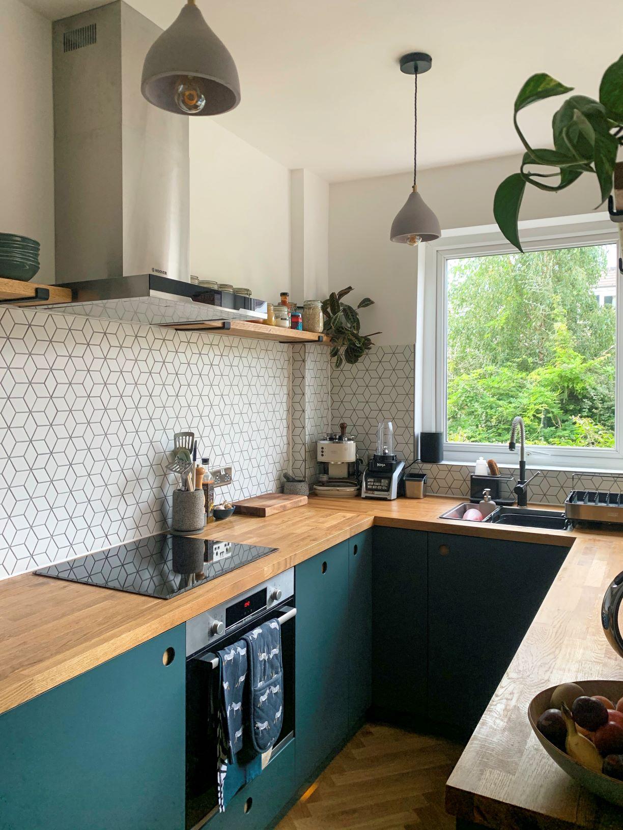
This U-shaped kitchen uses Naked Kitchens’ Ladbroke door fronts in our bold Brancaster Blue color – proving that bold colors can work brilliantly in small kitchens. As the eye moves upwards from the cabinets to the worktops to the walls the colors become lighter, creating a sense of airy space. Photo: @hlsjacobs
For more tips, see: Small but beautiful: A complete guide to designing and maximising the space in a small kitchen
Getting inspired: the Naked Kitchens paint color palette
Cabinet doors and fronts are perhaps the single most important color element of the kitchen: whether blending with the flooring and ceiling, or providing a contrast with a bold color.One option is to leave your cabinet doors naked and enjoy the natural colors of exposed wood: beautiful oak, light Scandi birch or rich walnut.But if you want color, at Naked Kitchens we take paint very seriously…So much so that we actually built an industrial sprayline in our workshop. We spray paint our doors once then pass under UV lighting for an exceptionally accurate and durable finish. We then leave them to dry for 24 hours, before applying a second coat. The result is a flawless color finish.Finding your ideal colors is no problem: we offer a color-matching service, or you can select from our range of Naked colors, all inspired by the North Norfolk coast and countryside on our doorstep. Here are a few examples of how our bespoke paint colors can bring a kitchen to life:
Beach Hut - soothing coastal blues
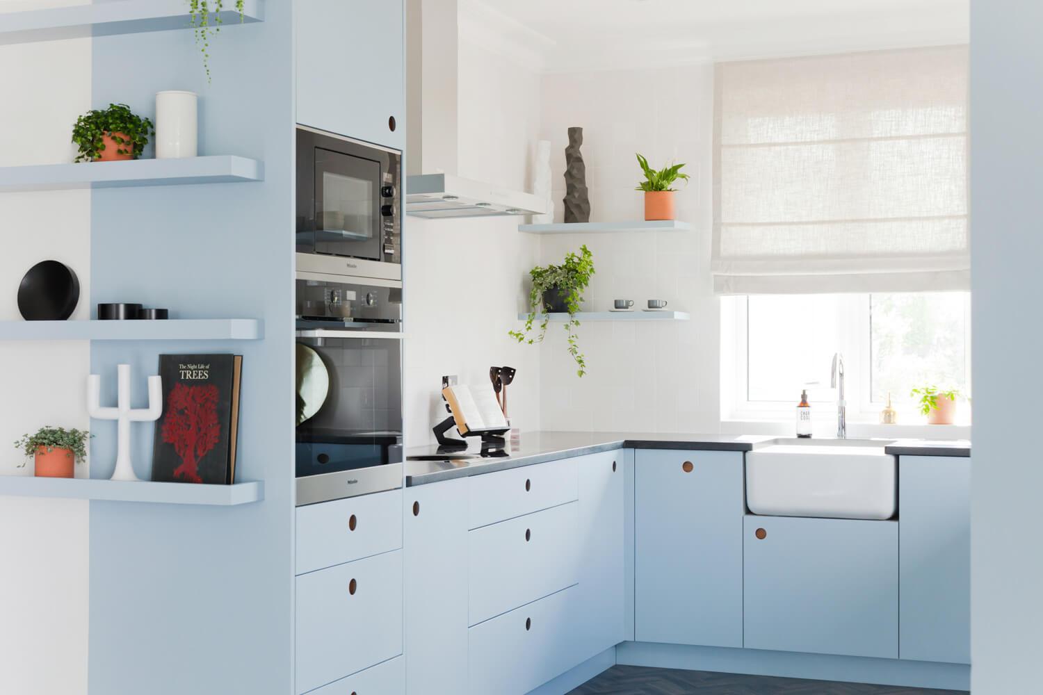
Inspired by the colorful huts lining the promenade at Old Hunstanton Beach, this lovely pale blue shade evokes coastal holidays and seaside retreats, creating a soothing and peaceful kitchen space.
Seal Pup White - soft warm tones
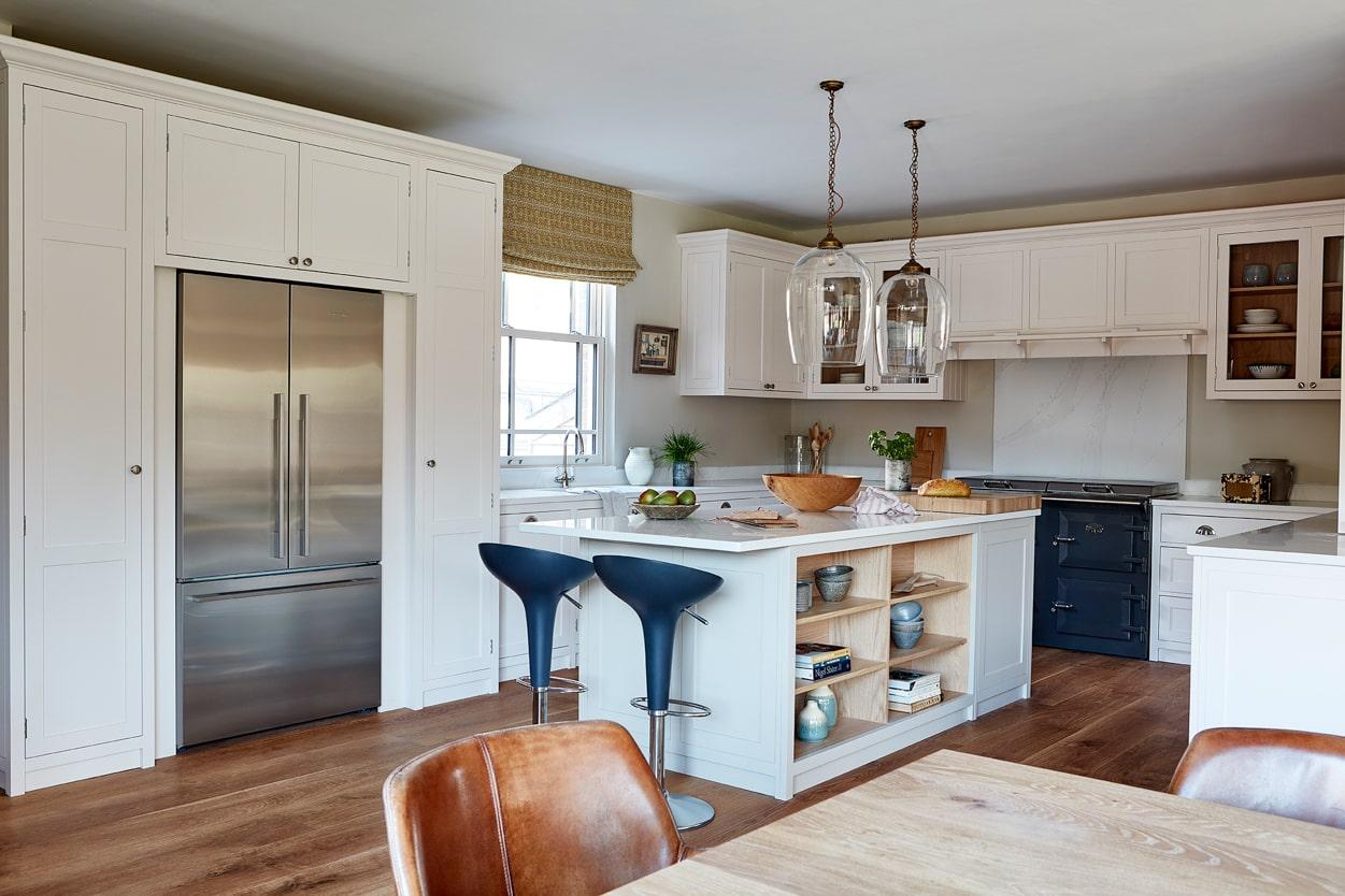
The local seals that inhabit the Blakeney coastline were the inspiration for our Seal Pup White shade, which reflects the warm off-white tones of the pups’ gorgeous coats, and works beautifully with a host of other colors.
Oyster Catcher - dark and elegant
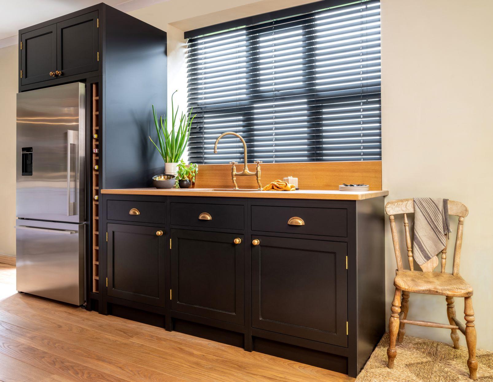
The oystercatchers at Cley and Blakeney are a much-loved part of our Norfolk heritage, and have even made their nesting place at our workshop…Our Oyster Catcher paint color is inspired by the striking dark plumage of these fine birds. So dark it’s almost black, this deepest of blue color schemes is all about elegance and sophistication.
Swallowtail - statement yellow
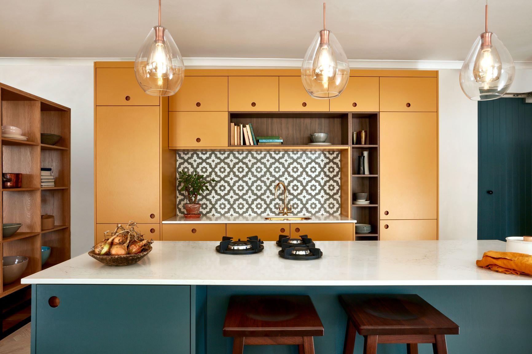
The swallowtail is Britain’s largest butterfly and a native to the Norfolk Broad. It’s known for its stunning yellow wings – a shade that’s perfect for a statement kitchen color.
See the full range of Naked paint colors here.
For more expert advice on creating your beautiful, bespoke kitchen, contact our friendly team or book a free design consultation with us.
Request a Brochure
To receive a digital copy of our brochure and regular updates from us, please complete your details below.