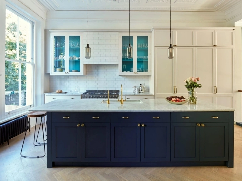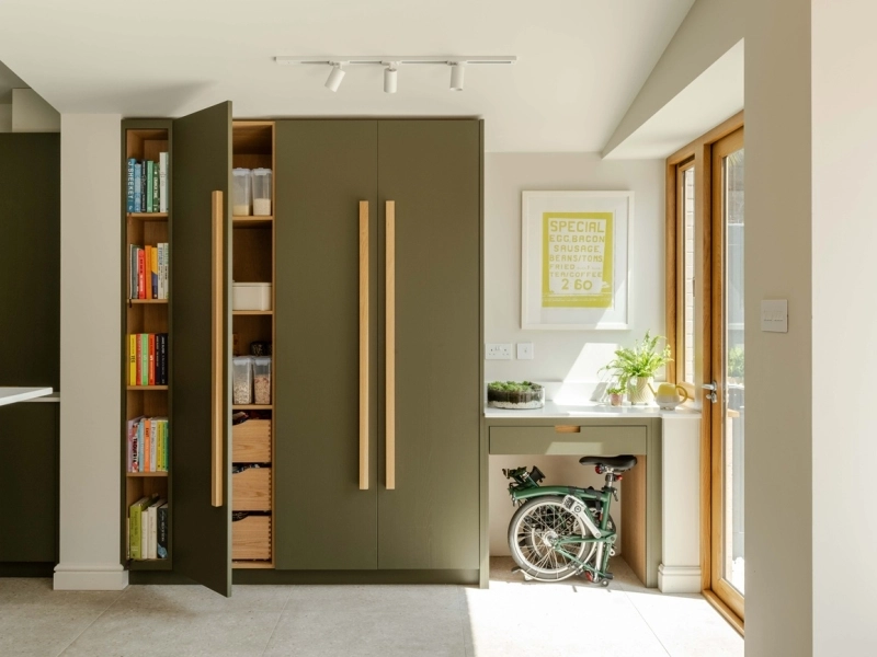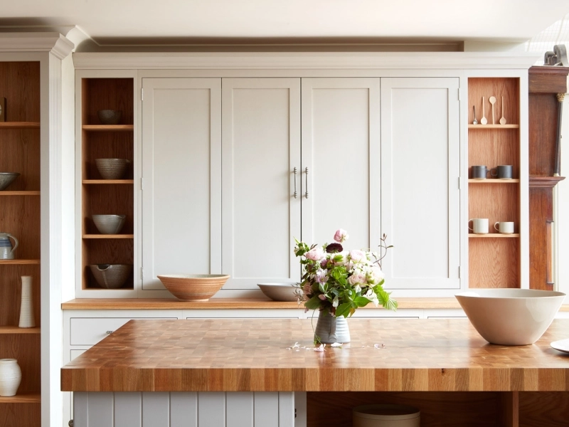
From soothing coastal blues to rich, bold palettes, different colours can have a huge impact on how a room feels, and also how we feel. Here’s a Naked guide to using colour to set the mood in your home...
Colour isn’t just decoration – it shapes how a room feels and how you feel in it. The key is not just choosing the right shades, but knowing how to use them — on real furniture, in real light, for real life.
How colour changes the mood of a room
Every colour has a personality. Some lift the spirits; others invite you to calm down The right palette can make a room feel lively and social, or calm and cocooning. The question to ask isn’t “What colours are trending?” but “How do I want this room to make me feel?”
- Warm colours (reds, pinks, terracottas, ochres) add energy and optimism — worth exploring for kitchens, dining rooms and family spaces.
- Cooler tones (blues, greens, soft greys) promote calm and balance — great for bedrooms, studies or dressing rooms.
- Neutrals act as breathing space, helping the eye (and the mood) to rest. There is a surprisingly large range of moods within neutrals such as greys, whites and taupes: neutrals can be cooler or warmer, and just as characterful as other colours.
Setting the mood: bold or subtle?

In the Houghton kitchen (above), rich pinks and purples paired with walnut and brass create a sociable, creative energy — a space that glows from morning coffee to evening cocktails.
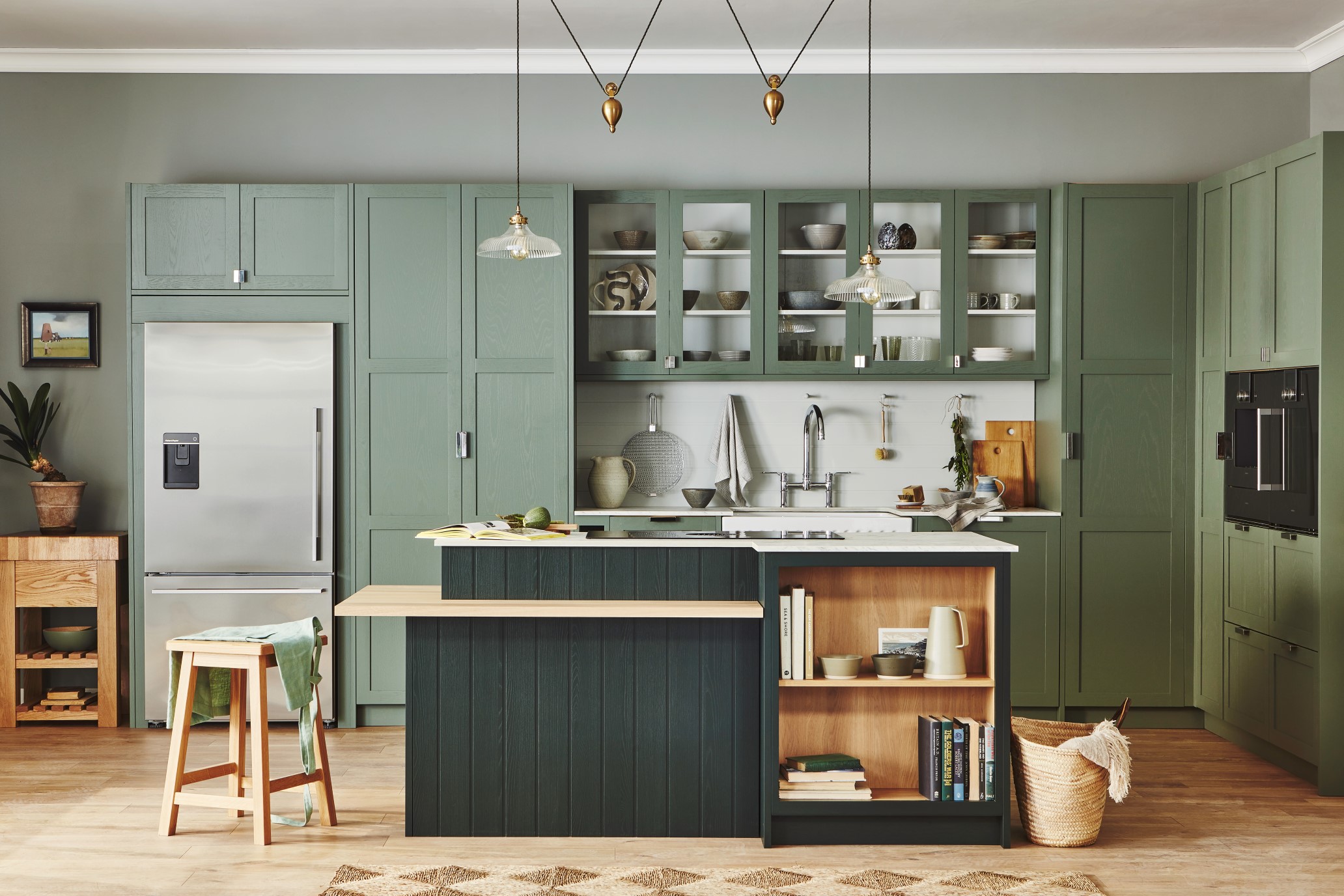
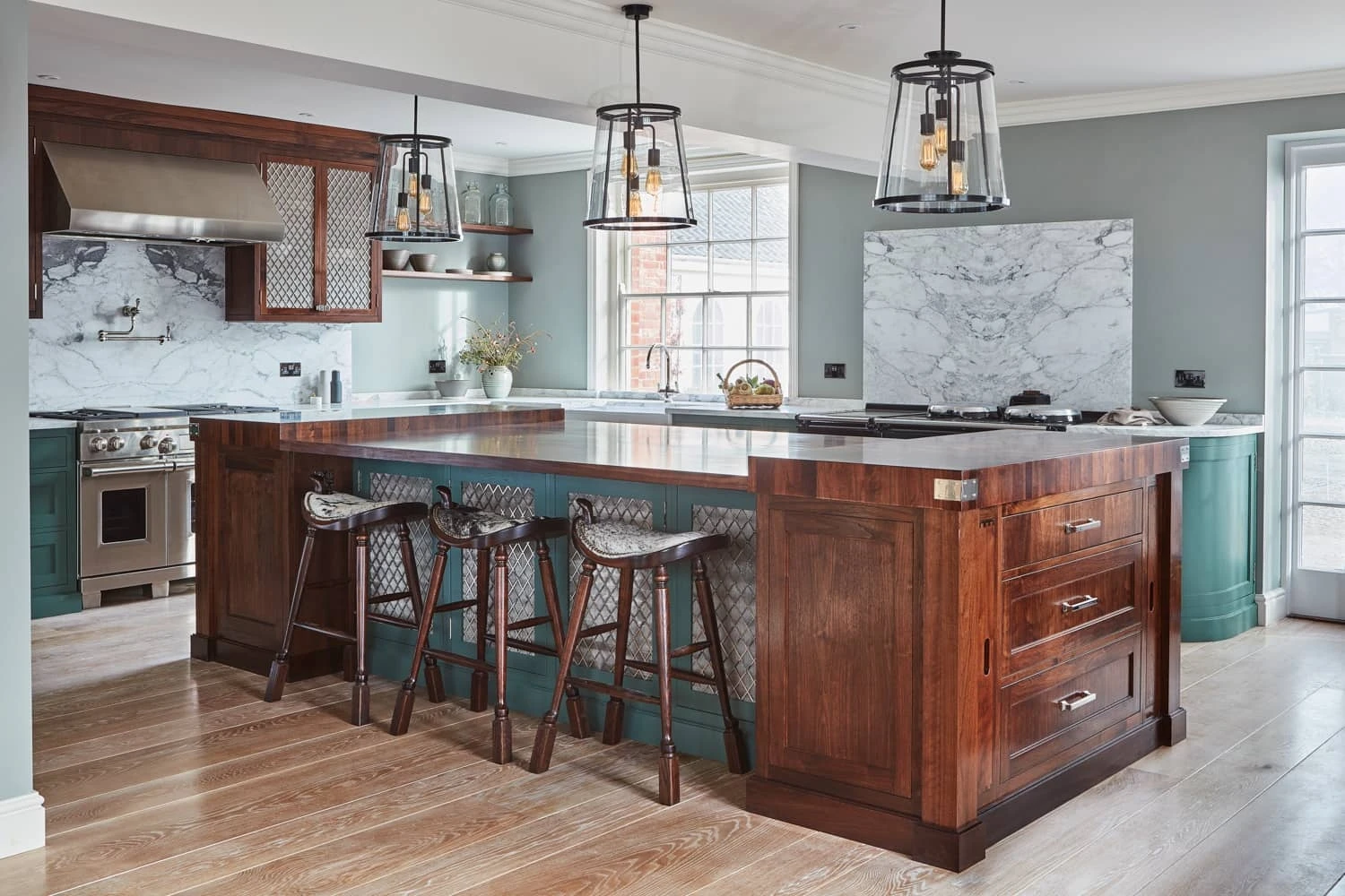
By contrast, the St Giles kitchen (below) uses three tones of green for a serene, almost garden-like calm. It’s proof that subtle colour can be as expressive as bold.
Tip: Start by asking what the room does — is it where people gather or where you unwind? Then build your palette around that feeling.
How to combine colours beautifully
Even the bravest colours need a plan. A few designer tricks make all the difference:
- Tonal harmony – several shades of the same hue (as in St Giles) create depth and calm.
- Analogous pairings – colours close together on the wheel (think green and blue) are easy on the eye and naturally soothing.
- Complementary contrast – opposites attract. Blue and orange, red and green, purple and yellow each give a spark of energy when used with restraint.
- The 60-30-10 rule – let one colour lead (60%), a secondary tone support it (30%), and a bold accent bring it to life (10%).
Tip: Don’t forget the role of materials. Painted timber, natural oak, and brass all affect how a colour reads — sometimes more than the paint itself. A soft green on oak cabinetry, for example, feels warmer and more organic than the same colour on smooth plaster.
Choosing your palette with confidence
Paint charts can be deceptive. Real colour is shaped by light, texture and proportion. Here’s how to approach your palette with the calm assurance of a designer:
- Test in context. Always sample your colours on the actual surface – painted on wood if it’s for cabinetry, or on card taped to the wall if it’s for the room. Look at it in daylight, lamplight and evening light; you’ll see three personalities in one shade.
- Layer your tones. Don’t stop at a single colour. Combining two or three tones of the same hue — say, a deep island with paler cabinetry – gives the space rhythm and interest.
- Balance warmth and coolness. If your walls or tiles are cool-toned (blue or grey), add warmth with wood, brass or pink-based neutrals.
- Echo colour through the house. Using related tones in different rooms creates a natural flow and avoids a “patchwork” feel.
- Trust your instincts. The colours you’re drawn to usually reflect the kind of atmosphere you crave – lively or peaceful, playful or elegant.
Tip: Don’t let a small room scare you off strong colour. Deep tones can make a compact space feel warm and sophisticated, especially when combined with good lighting and pale flooring.

Using colour to transform every room
At Naked, we mostly paint on timber, not plaster — which means colour comes alive in a particular way. Grain, light and texture all interact, creating subtle shifts through the day. Our Norfolk-inspired palette was designed for this — from the misty blues of coastal mornings to the deep greens of woodland and saltmarsh.
Here’s how colour works its magic across the home...
Create a tranquil bedroom retreat

Soft blues and neutrals reduce visual noise and soothe the senses. In The Hall dressing room, painted furniture in First Flight blue and Baked Cley grey creates a haven that feels restful yet refined — proof that calm can still have character.
Try this: Pair pale blue cabinetry with warm wood flooring or brass handles.
Brighten with Scandi simplicity

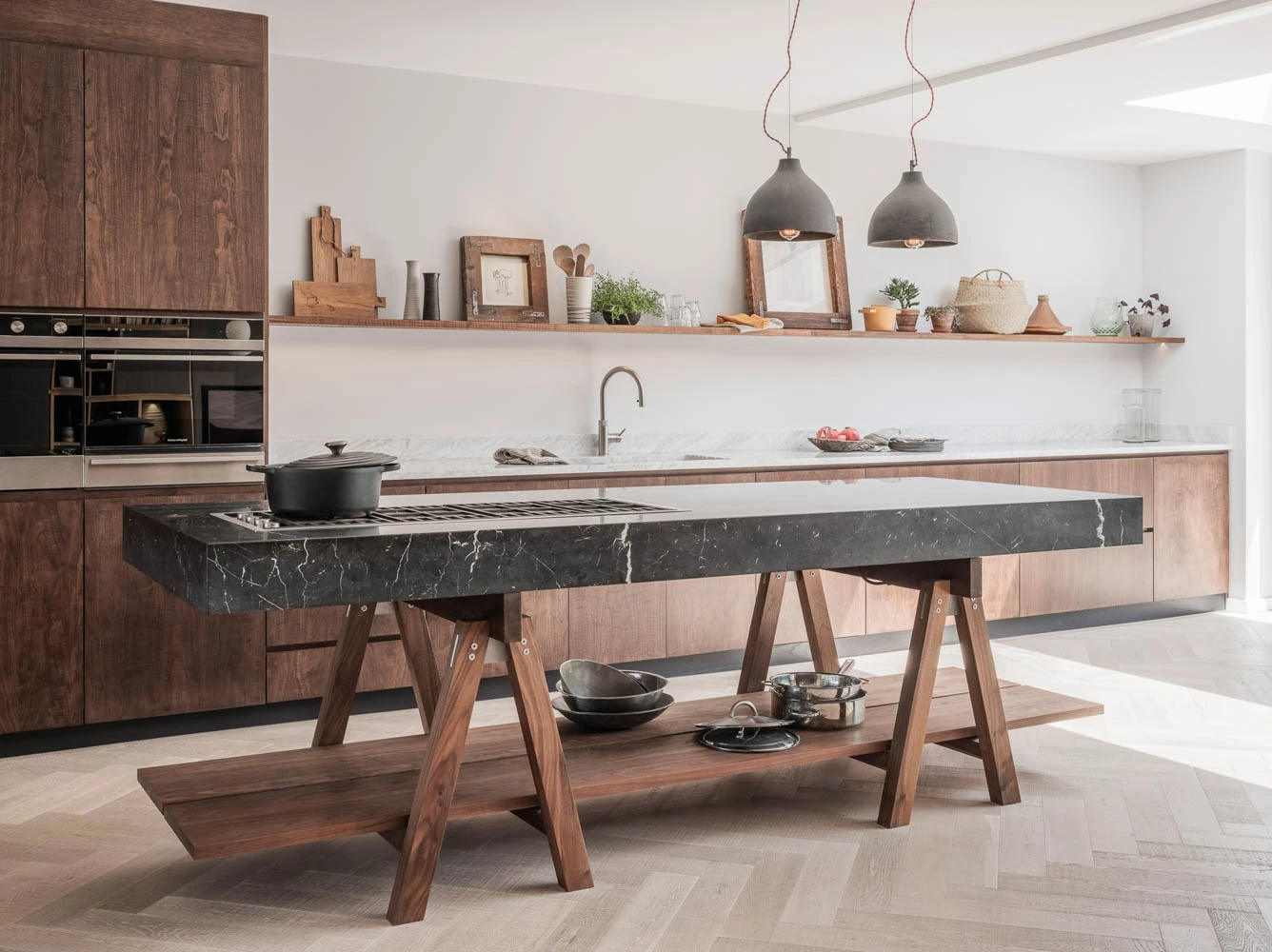
Using neutrals or monochrome doesn’t have to mean cold. The Glaven kitchen (above) shows how whites and neutrals can feel fresh and welcoming when balanced with timber and texture. White worktops and brushed limed oak give a clean, energising look with real warmth.
Tip: Add one natural element — wood, rattan or linen — to stop monochrome from feeling clinical.
Find your colour confidence

Bathrooms don’t need to be bland. This freestanding cupboard, painted in bold purple, adds real character – a stunning bespoke piece that feels like heirloom furniture, and proving that strong, vivid colours can work in any room.
Tip: Anchor strong colours with a natural material like oak or stone - it creates a timeless, trend-proof feel.
Don’t forget the in-between spaces

Colour isn’t just for showpiece rooms. A utility room painted in earthy neutrals, or a boot room in a rich blue-grey, turns everyday chores into small pleasures. Even a narrow hallway can feel considered and welcoming with a painted bench or cabinetry in a single confident hue.
Tip: Choose one accent colour you love and repeat it subtly throughout the house — perhaps on a pantry door, a dresser interior or even a window frame — for a sense of cohesion.
The Naked approach to colour
From expansive skies to glistening coastlines, our range of paint colours are inspired by the magnificent Norfolk scenery that surrounds our workshop and showroom.
We can also create any colour with our custom colour-matching service – and our state-of-the-art sprayline technology means our cabinetry is painted with unmatched accuracy (and minimum waste).
Browse the Naked palette here.
See also:
How to Choose a Colour Scheme for Your Kitchen
Photo top by Malcolm Menzies. Interior design by Dani Neville




-800x600.webp)
