


 Soft greys and taupes, pale greens and timber tones – warm neutrals bring a richness to kitchens that reveals itself over time…
There’s a reason warm neutrals have become a mainstay of contemporary kitchens, and it isn’t simply that they’re “safe” or easy to live with. Done well, they create spaces that feel immediately calm and beautiful from the moment you walk into them, but also characterful and with a sense of depth that keeps giving.
As Naked’s Head of Design Jayne Everett puts it, “Warm neutrals have been hugely successful… At the moment they’re the go-to.”
That success is easy to understand. These are colours that sit comfortably with the way people actually live, and with the materials that great kitchens are made from.
A palette rooted in the natural world
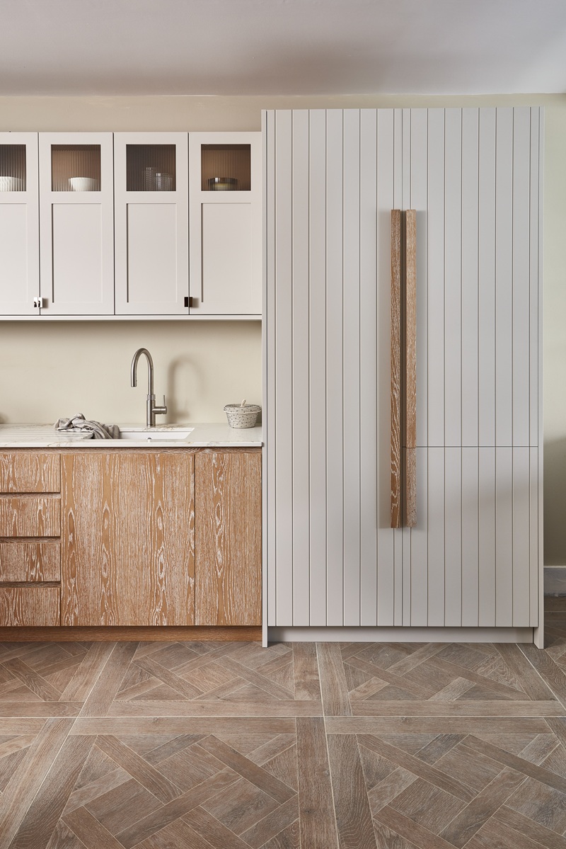
Warm neutrals tend to draw from the same places as the materials around them: chalk, stone, clay, timber, sand. Even when the colour is technically a grey or an off-white, there’s often a softness to it – a hint of warmth that stops it feeling stark or sterile.
That might be a soft, slightly taupe grey rather than a steely one, a creamy white that carries a trace of yellow rather than blue, or a whisper of pink. Even a very pale green, which we think of as a cool colour, can bring hints of foliage and a warm feeling of being closer to the natural world.
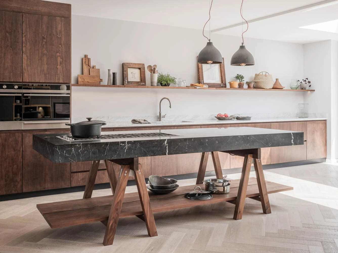
Alongside these sits timber – especially something like a pale or limed oak – which functions almost as a neutral in its own right. Used on cabinetry, shelving or internal details, it brings both warmth and variation without ever overwhelming the space.
Calm, but never dull
One of the misconceptions about neutral palettes is that they risk feeling flat. In reality, the opposite is often true.
“Our taupey colours… you wouldn’t call them dull or boring,” says Jayne. “They’re stunning… you walk into the space and it’s very calming.”
That sense of calm is about balance. Warm neutrals tend to absorb light rather than bounce it back harshly, which gives them a softer, more forgiving quality across the day. Morning light lifts them; evening light deepens them. Over time, they begin to feel part of the fabric of the room – as if they’ve always been there rather than something you’ve applied to it.
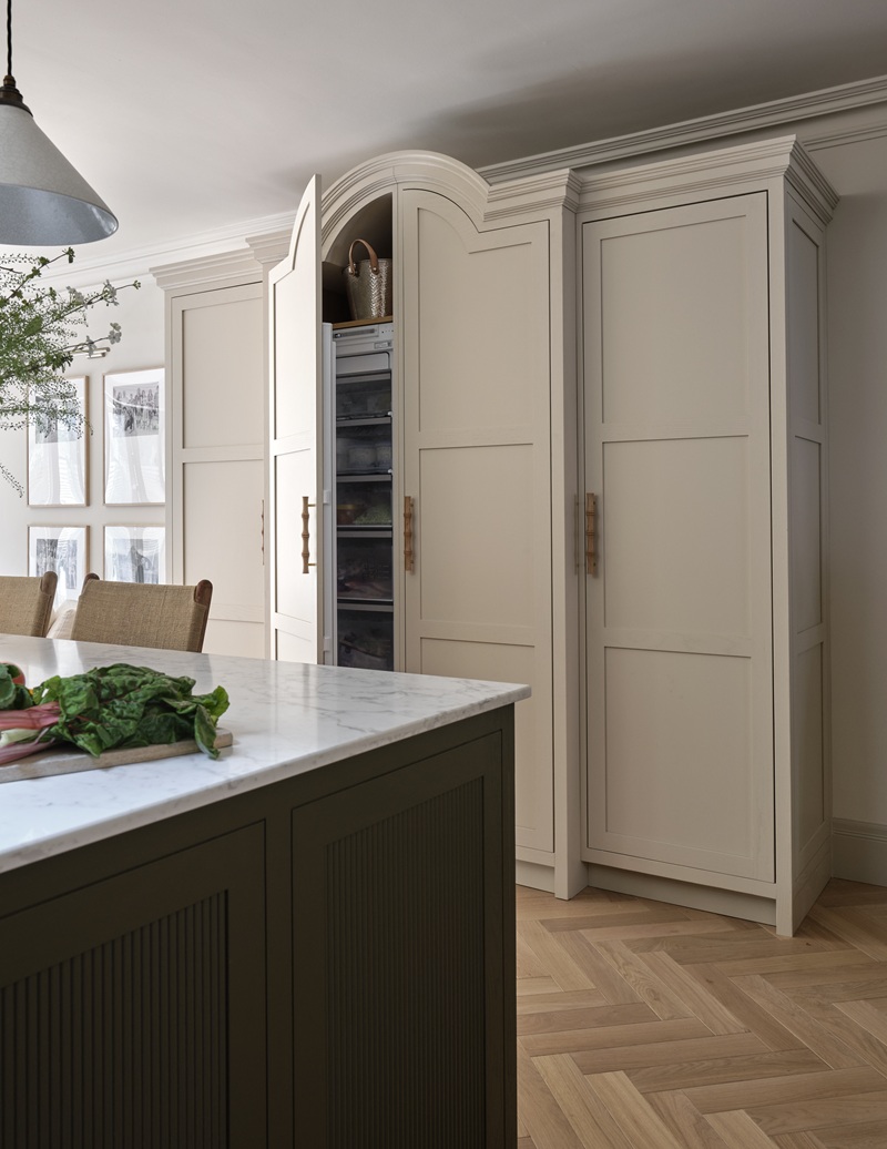
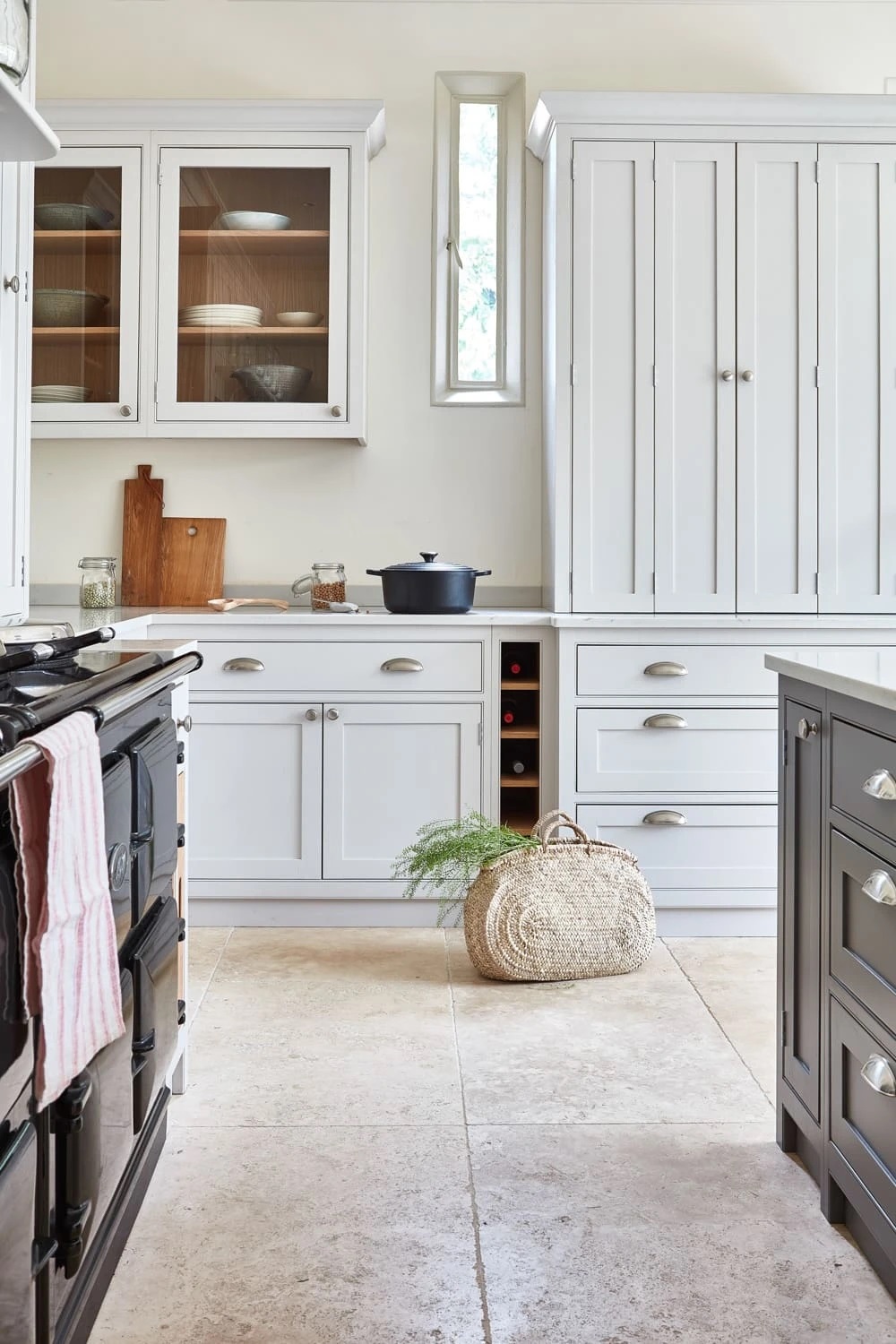
Neutral, yet full of character: a stunning freestanding cupboard with arched cabinet top and cornice in the Barnes kitchen
Building depth through subtle variation
Perhaps the most interesting thing about warm neutrals is how well they work together.
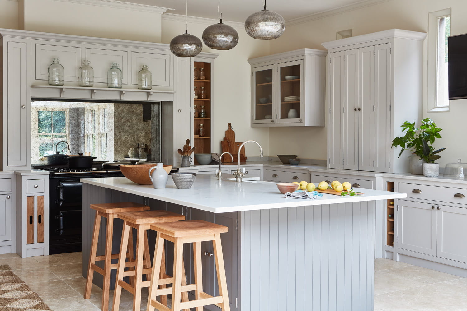
Rather than relying on contrast in the traditional sense, many kitchens now use tonal layering – slight shifts within a similar palette to create depth without disruption. A kitchen might combine two or three closely related shades across cabinetry, walls and island, each one distinct but connected.
As Jayne notes, “When you combine them, it adds a really gorgeous depth to the cabinetry.”
This is where warm neutrals come into their own. Because they sit so comfortably alongside one another, they allow for variation without clashing.
Letting materials take the lead
Timber is often the natural partner for a warm neutral, whether that’s a run of oak cabinetry, open shelving, or simply a worktop or detail that introduces grain and texture.
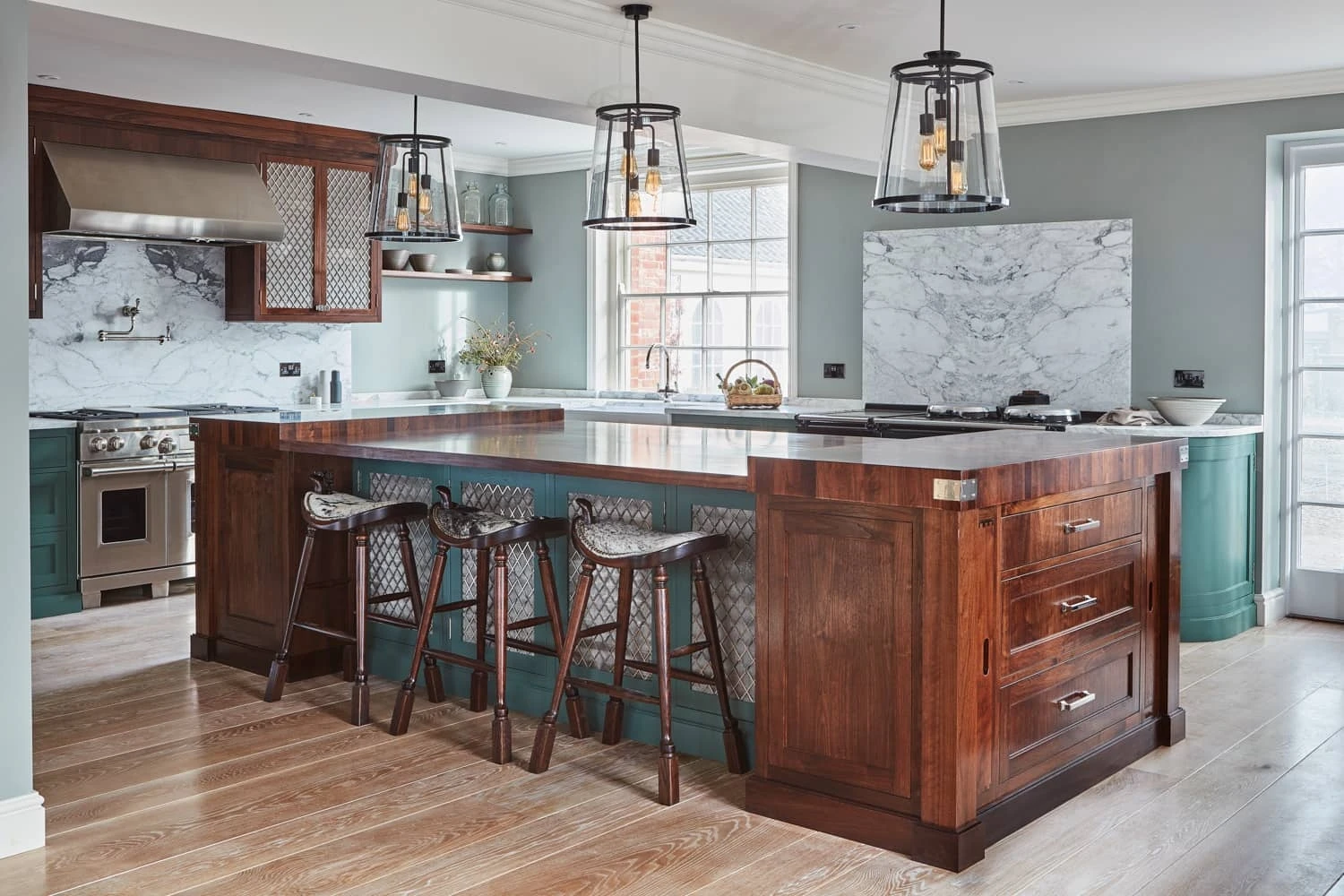
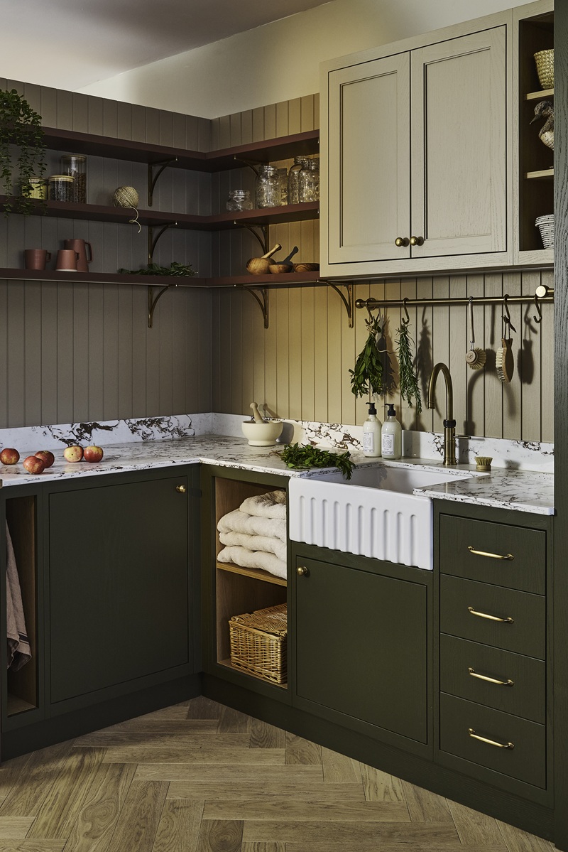
Stone and marble play a similar role, particularly when paired with softer cabinet colours – a pale, veined surface can lift a muted palette without breaking its mood.
Metals also take on a particular role. A polished nickel tap or a soft brass handle can sit easily within a warm scheme, adding points of interest without being a sharp contrast.
Working with light
Light is what really brings warm neutrals to life.
In a bright, south-facing kitchen, they can feel gently sunlit, with underlying tones becoming more apparent as the day moves on. In cooler, north-facing spaces, they tend to hold their warmth more consistently, preventing the room from feeling flat or grey.
It’s worth looking at colour samples in the actual space wherever possible. The same shade can behave quite differently depending on orientation, glazing and time of day.
Introducing contrast
When it comes to introducing colour contrast, then once again, the great thing about warm neutrals is that you have so many options.
A slightly brighter white on worktops or splashbacks can sharpen the overall palette without making it feel stark. A deeper tone on an island or larder can anchor the room while still sitting comfortably within the scheme.
For those who want a little more energy, warm neutrals also provide an ideal backdrop for stronger colours – whether that’s a painted interior to a glazed cabinet, a piece of artwork, or a single more vivid element that draws the eye without overwhelming the space, such as an island.
Thinking beyond cabinetry
One of the pleasures of working with warm neutrals is how easily they extend beyond the cabinets themselves.
Walls, ceilings and even architectural details can be brought into the same tonal family, creating a sense of cohesion. Colour drenching – carrying a tone across multiple surfaces – can be particularly effective here, especially with softer shades.
A sense of confidence
Finally, a great part of the appeal of warm neutrals lies in their longevity. Essentially, they’ll never go out of style, because they can hold everything together in the background while other colours and materials (and objects, and even people) take centre-stage.
Or, as Jayne puts it more simply: “Put the colour in that you love today – and that you’ll still love in twenty years’ time.”
That’s something that warm neutrals do very well indeed.
Whether it's something from the Naked palette or a custom colour, we can help you find the warm neutrals that are just right for you. Start your bespoke kitchen journey here.
See also:
What really elevates a kitchen? Design insights from Jayne Everett
How to Choose a Colour Scheme for Your Kitchen


-800x600.webp "Designing a kitchen for busy family life")


-800x600.webp "The most common kitchen layout mistakes (and how to avoid them)")
