No products match your search.
Navy Blue Kitchens: The bold colour that can act like a neutral
Written by Andrew Nixon

As kitchen colours, navy and dark blues pull off a remarkable trick: they’re bold yet they can act almost like a neutral colour. Here’s how to get the best out of the deeper blues…
Navy and dark blue kitchens are enduring favourites for a reason. They feel smart and grown-up, but still with plenty of personality to keep the room interesting.
In fact, darker blues manage a number of balancing acts: they’re bold but not shouty, classic yet always contemporary. Navy has depth and confidence but never feels too outrageous or showy-offy. It brings strong colour into a kitchen without the sense of risk that comes with brighter shades.
Above all, navy blue has a timelessness, and a way of working beautifully with the materials and details around it that that makes it feel almost like a neutral.
Why dark blue works so well in kitchens
Blue is at the cool end of the spectrum and has long been associated with calm and order, which makes it a good fit for a room that has to work hard every day. And darker blues bring something extra: a sense of weight and definition. They can make cabinetry feel more architectural, add drama to an island, or give a room a polished, almost ‘tailored’ feel.
Unlike black or very dark grey, dark blue still has visible colour in it. That gives it warmth and a sense of character, especially as the light changes through the day. In the morning, it can feel crisp and fresh. In the evening, it can feel richer and more atmospheric.
It is also wonderfully adaptable. A navy kitchen with marble and brass can feel elegant and classic. Pair the same dark blue with oak, pale walls and open shelving, and it becomes softer and more informal. Use it with clean lines and minimal detailing, and it can look sharp and contemporary.
Navy blue as a kitchen neutral
One reason navy works so well is that it behaves a little like a neutral.
It sits comfortably with whites, creams, greys, timber, stone, brass, copper and stainless steel. It can be used across a whole run of cabinetry, on a kitchen island, or as part of a two-tone scheme without fighting everything around it.
That makes it a useful choice if you want a kitchen with colour, but not a colour that dominates the room.
Where white can feel too plain, and black can feel too severe, navy gives you that same sense of structure and versatility, only with more softness and character.
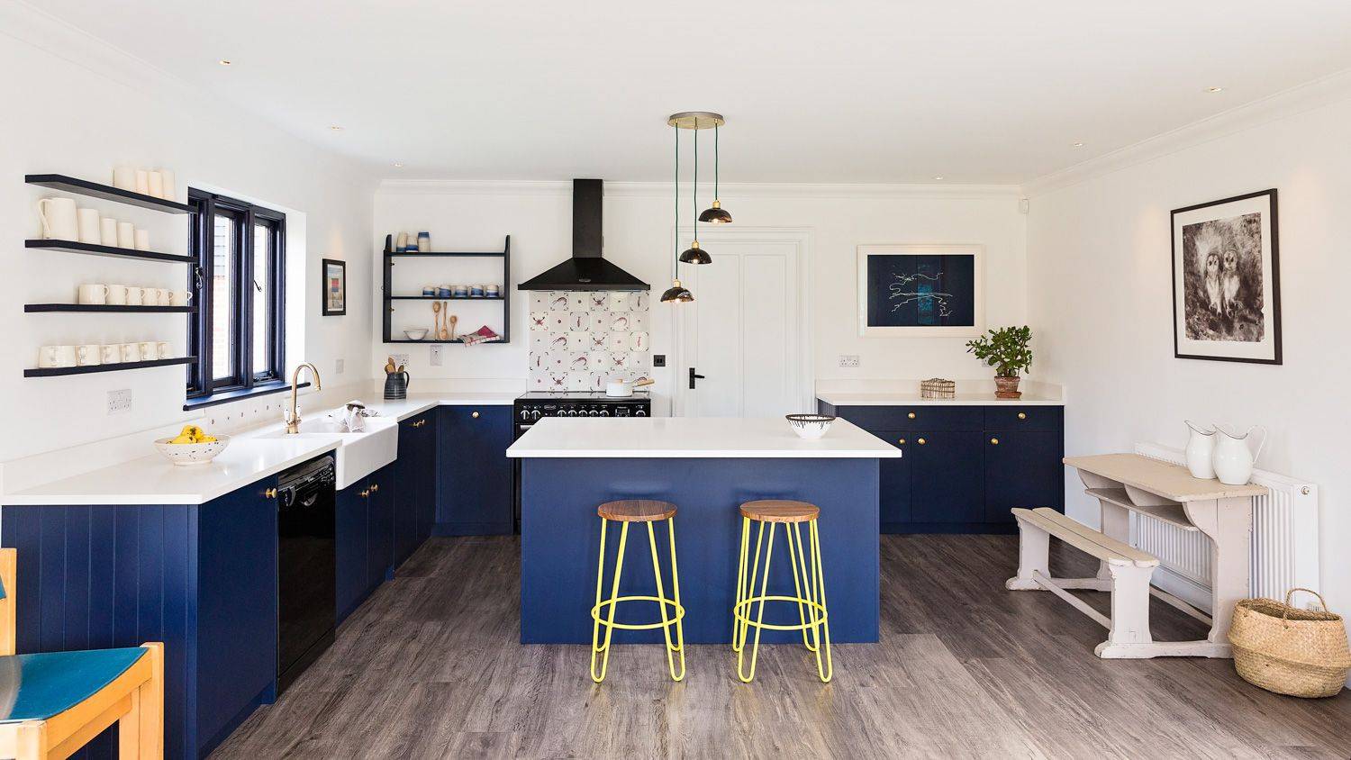
In the Beach House kitchen, dark blue acts like a neutral, providing a base for the bold pops of colour and pattern
Choosing the right dark blue
Not all dark blues are the same... A true navy has a classic, tailored feel (think officer uniforms). It is smart and composed, and very easy to pair with other materials.
A blackened blue feels moodier and more dramatic, particularly in evening light or in a room with lower natural light.
A slightly greener blue, closer to petrol or ink, can feel richer and more contemporary.
A brighter royal blue, while still beautiful in the right setting, creates a very different effect from a deep, muted navy; it feels fresher and more energetic
As with any kitchen colour, it’s important to look at the shade in context. The same blue can appear cooler, warmer, darker or brighter depending on the light in the room, the direction it faces, and the materials around it. (Which is why it’s a good idea to get some samples!)
What to pair with navy kitchen cabinets
Because navy is so versatile, it gives you plenty of ways to influence the mood of the kitchen. The colour provides the depth, while the surrounding materials decide whether the finished effect feels crisp, classic, relaxed, dramatic or luxurious.

A crisp white and navy combination in the Surrey Malthouse kitchen (also pictured top)
Navy and white: crisp and fresh
Navy and white is the most obvious pairing, and for good reason. The white keeps the scheme fresh and prevents the dark cabinetry from feeling too heavy. The navy adds depth and contrast. Together, they create a clean, classic look that works especially well with pale walls and stone worktops – perfect if you have good natural light.
It’s a particularly strong combination for Shaker kitchens, where the dark blue gives traditional cabinetry a more tailored, contemporary feel.
The nature of the white is also important: a very bright white creates sharper contrast and a more modern feel, while softer whites and warm neutrals create something gentler and easier on the eye.
Navy and timber: warmer and more relaxed
Timber is one of the best ways to soften a dark blue kitchen.
Oak brings warmth and lightness, stopping navy from feeling too formal. Walnut adds richness and depth, creating a more luxurious mood. Even small touches – stools, shelves, drawer interiors, chopping boards or flooring – can make the colour feel more natural and liveable.
This is a good route if you like the confidence of navy but do not want the kitchen to feel too crisp or polished.
Navy and marble: smart, plus a touch of glamour
Dark blue and marble are a classic combination. The depth of the blue makes pale marble or marble-effect quartz feel brighter, while the movement in the stone stops the overall scheme from feeling too flat. Add brass, bronze or antique metal details and the result can feel elegant without tipping into showiness.
A heavily veined worktop or splashback will make the scheme feel more dramatic, while a simpler-looking stone will give you something calmer and more understated. Again, navy is flexible enough to go either way.

The navy Shaker cabinets in the island work beautifully with the marble worktop and brass details in the Chepstow Villas kitchen
Navy and brass: a natural pairing
Warm metallics lift the blue and add a little glow, particularly in a darker room or in the evening. Brass handles, taps, hinges or lighting can bring just enough warmth and detail to stop the scheme feeling too cool.
The trick is not to overdo it. A few well-chosen details usually work better than trying to make every fitting match perfectly.
Antique brass, aged bronze or copper can all work beautifully with navy, depending on how warm or traditional you want the scheme to feel. Cleaner metals such as chrome or nickel will take the kitchen in a sharper, more contemporary direction.
Dark blue kitchen islands
If you are not sure about using navy across the whole kitchen, an island is a very good place to start.
A dark blue island can anchor the room and create a clear focal point, especially in a kitchen with paler perimeter cabinetry. It provides the depth and character of navy without making the whole space feel dark.
This works particularly well in open-plan kitchens, where the island acts almost like a piece of furniture between the cooking, dining and living areas.
A navy island can also be a useful way to introduce contrast into a neutral kitchen. It gives the room a centre of gravity, while still allowing the wider space to feel light and open.

The blue island in the Raynham kitchen provides depth and weight
Two-tone navy kitchens
Navy is also excellent in two-tone kitchens.
It pairs naturally with soft whites, pale greys, warm neutrals and timber finishes. Used on lower cabinets with lighter wall cabinets above, it can ground the room while keeping the upper half of the space light and airy.
Or you can use dark blue on a tall bank of cabinetry, a pantry, a drinks cabinet or a breakfast station, creating a more deliberate feature within the room.
The best two-tone schemes tend to have a clear logic. Navy should have a role to play, such as highlighting or adding depth, rather than feeling randomly applied. When used thoughtfully, it can help define zones within a kitchen, especially in larger or more open-plan spaces.

Using navy with whites and natural light in the Chepstow Villas kitchen
Is navy too dark for a kitchen?
Not necessarily…. Dark colours can work beautifully in kitchens, but they do need some balance. The amount of natural light, the size of the room, ceiling height, flooring and worktop colour will all affect how navy feels.
In a very bright room, navy can bring welcome depth and stop the space feeling washed out. In a smaller or darker room, it may work better on an island, lower cabinets or a single run, paired with paler walls and reflective surfaces.
The size of the kitchen is another factor. A small kitchen can still carry a dark blue beautifully if there is enough contrast and good lighting. In a larger kitchen you may need plenty of texture and variation to prevent it feeling too flat.
Adding character to a navy kitchen
Because navy is such a useful and popular kitchen colour, the details around it become especially important. This is where you can make the kitchen feel entirely your own.
That might mean using an unusual handle, a warmer worktop, an unexpected wall colour, a beautiful tiled splashback, open timber shelving, painted interiors or a contrasting pantry. Small decisions can shift the whole mood of a navy kitchen.
Just as with a neutral, navy gives you a strong foundation, but the personality comes from what you build around it.

The Mill House kitchen is bursting with contemporary character, with navy providing a solid base
Dark blue kitchens and different styles
One of the reasons navy has lasted so well is that it adapts to different kitchen styles.
In a classic Shaker kitchen, navy adds a tailored, almost heritage feel. It brings out the lines of the cabinetry and gives the whole room a sense of permanence.
In a contemporary kitchen, dark blue can soften the sharpness of clean lines and flat-fronted doors, making the space feel more inviting.
In a coastal kitchen, blue is an obvious choice – but a deeper navy can feel more grown-up than pale nautical shades. Paired with timber, off-whites and natural textures, it creates a relaxed feel without becoming too themed.
And in a colourful or eclectic kitchen, navy can act as the steadying influence, giving other colours something to push against.
Navy blue kitchens have lasting appeal because they offer the best of both worlds. They bring depth, atmosphere and colour, but they are also calm, versatile and easy to live with. They can be classic or contemporary, crisp or relaxed, polished or practical.
If you’d like to explore the wider world of blue and navy kitchens, you can also take a look at our guide to blue kitchen ideas or browse our collection of navy kitchen designs – or talk to one of our designers about creating something tailored to your space.
See also
Request a Brochure
To receive a digital copy of our brochure and regular updates from us, please complete your details below.