No products match your search.
Blue Kitchen Ideas and Inspiration: The Kitchen Expert
Written by Andrew Nixon

Here’s our expert guide to using the colour blue in your kitchen – everything you need to know, plus plenty of beautiful blue inspiration…
Naturally associated with the sky and the sea, blue sits at the cool end of the colour spectrum. It’s known to be calm and soothing, so it makes a good choice for introducing a little serenity into a busy kitchen.
But blue is incredibly versatile, with shades ranging from gentle sky-blue to bold electric blue, from rich jewel tones to deep navy blues. Different blues can work in all kinds of kitchen spaces: contemporary, minimalist, traditional Shaker style, even rustic farmhouse kitchens.
Which blue you select, and how you use, can make a huge difference to the tone of your kitchen – and indeed your whole home. Soft coastal blues will offer a calm and relaxed feel, and can make a kitchen feel lighter and more open, while bright blues add a sense of energy and vibrancy, and deep blues lend an elegant, sophisticated look.
For more about the art and science of kitchen colours, see Choosing colours for your kitchen – an expert guide.
Serene, elegant, contemporary: the
Westbourne Gardens kitchen
features cabinets in pale Beach Hut blu e
Ways to bring in blue into the kitchen
- Cabinet doors and drawers – set the tone for your kitchen with cabinet and drawer fronts in a blue, a mix of blue and neutral, or even several complementary shades of blue.
- Blue cabinet interiors with glazed doors – a subtler way to bring colour in via your cabinets is to paint the interiors in blue and use glass doors.
- Feature walls – blue is a great choice for a feature wall, especially when contrasting with a white.
- Kitchen islands – a kitchen island in a bold blue can be an eye-catching focal point for the room.
- Splashbacks – tiled splashbacks are good for colour contrasts in a kitchen, or to enhance a blue colour scheme.
- Lighting – glass or ceramic pendant lights are a clever way to bring colour into the room (see more kitchen lighting ideas here).
- Blue glassware and crockery – great for the little finishing touches.
- Artworks – from bold statement abstracts to seascapes and sky-heavy landscapes, well-chosen artworks can bring a blue colour accent into a kitchen space.
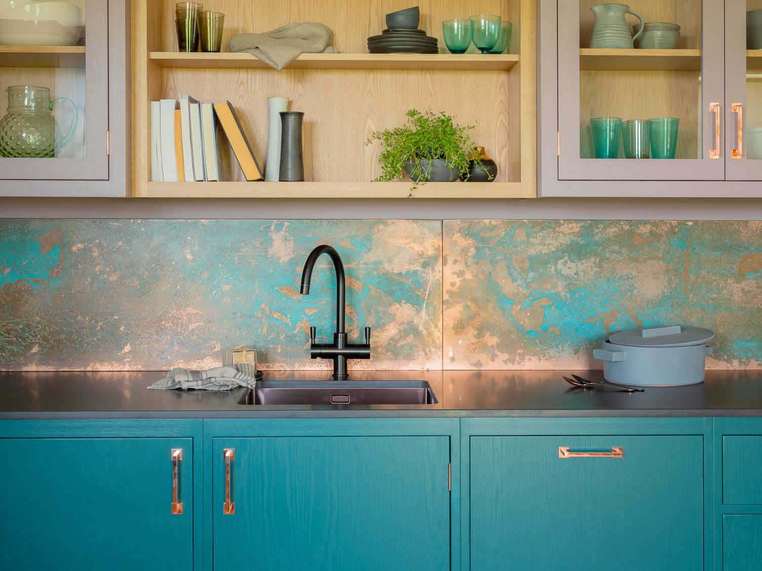
Bringing in the blues: In the
Hampton Court kitchen
the cabinets in Pierhouse blue complement the gorgeous tones in the oxidised copper splashback
Combining blues with other colours in a kitchen
A good place to start when thinking about using blue in a kitchen is the ‘60:30:10’ principle – a classic rule of thumb for getting a harmonious balance of colours in a space. The idea is to
use three colours in an approximate ratio of 60:30:10, so that the largest area (about 60%, typically the flooring, ceiling and the worktops) will be in one colour, and about 30% – say, the cabinets and large appliances – will be a second colour. Finally a third accent colour will be used for the remaining 10% of the space: perhaps smaller accessories or a tiled splashback.
Blue always works brilliantly with whites, so a tried-and-test use of blue in a kitchen would be as the secondary colour (30%) for the cabinets, in combination with a white as the main 60% colour for the walls and ceiling.
But blue is also great as the main colour in a kitchen, perhaps in conjunction with yellows or oranges, and with metallic or natural timber colours. And you can also use multiple shades of blue together for a deep, multilayered feel.
The
Clarence kitchen
uses Naked Kitchens’ Blakeney Channel blue as the secondary colour, with white acting as the main colour. The handle-backings in the cabinets are painted in a third colour: an eye-catching orange, which sits opposite blue on the colour wheel and makes for a striking colour ‘pop’.
Using blues in a kitchen: 6 different ideas to inspire you
To get your creative juices flowing, here are some different approaches you can take to using blue in your kitchen…
1) Contrast bold blues with strong whites for energy and vibrancy
The
Beach House kitchen
combines bold blue cabinets with bright white walls and worktops
Bold blues work beautifully with bright whites, with the contrast between the two making for a really vibrant feel.
In the Beach House kitchen (above), our Slab cabinets are painted in Little Greene’s Deep Space Blue, and against the brilliant whites of the walls and worktops the blue colour really sings. The effect is striking, energetic and contemporary.
2) Use soft coastal blues along with neutrals for a calm, relaxing kitchen
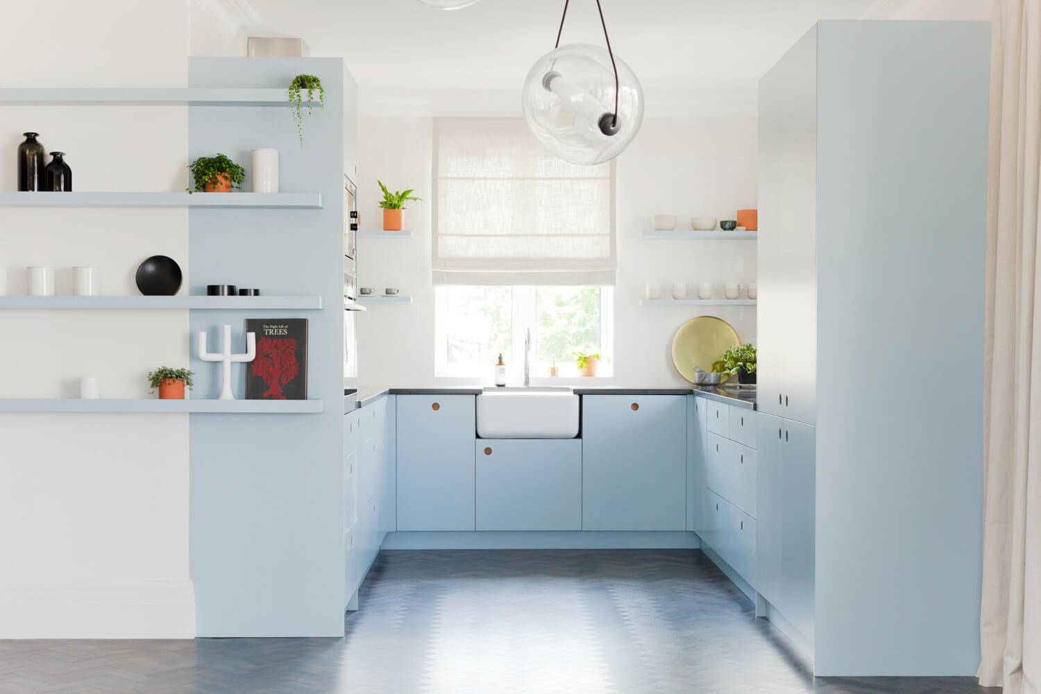
A serene space: the
Kew Penthouse kitchen
in white and Beach Hut Blue
Whereas bold blues contrast energetically with whites, pale and pastel blues complement neutrals for a serene, calming effect.
It’s virtually impossible to feel stressed in a room like the Kew Penthouse kitchen (above). It combines Naked Kitchens’ own Beach Hut Blue painted cabinets with subtle white hues, making for a light and open space with an almost ethereal feel.
3) Go for luxurious elegance with very rich, dark blue cabinets
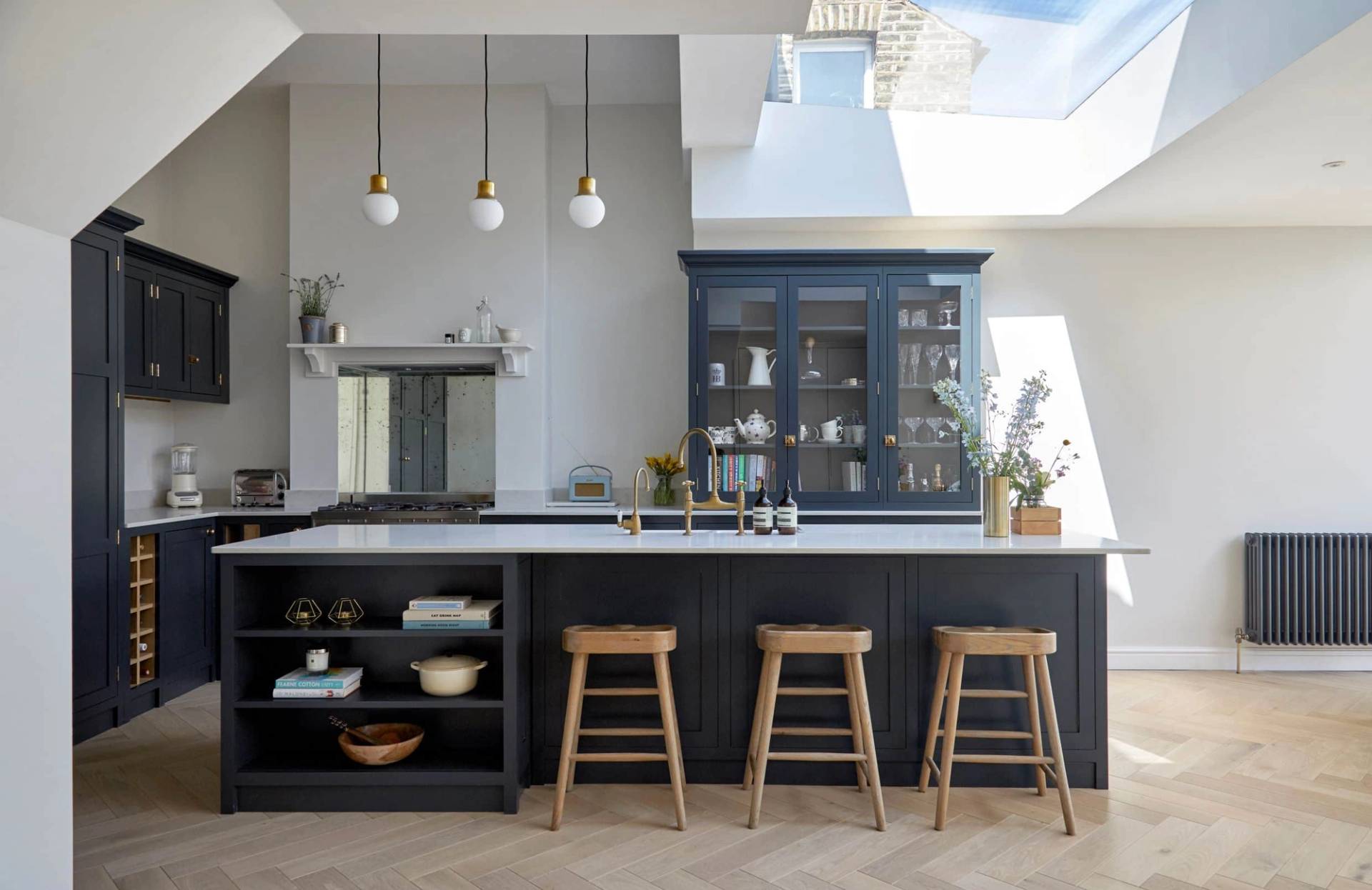
Timeless elegance: the
Heathwood Gardens
kitchen features cabinets in Naked Kitchens’ dark Blakeney Channel blue
Dark blues and navies can give a sense of timeless elegance, even luxury, to a kitchen space.
The Heathwood Gardens kitchen (above) is a bright, sunlit and relatively minimalist space, but the dark blues of the cabinets along with the brass colours in the handles, pendant light fittings and taps provide that hint of luxury and traditional refinement.
4) Combine blues and natural woods for a welcoming, homely feel
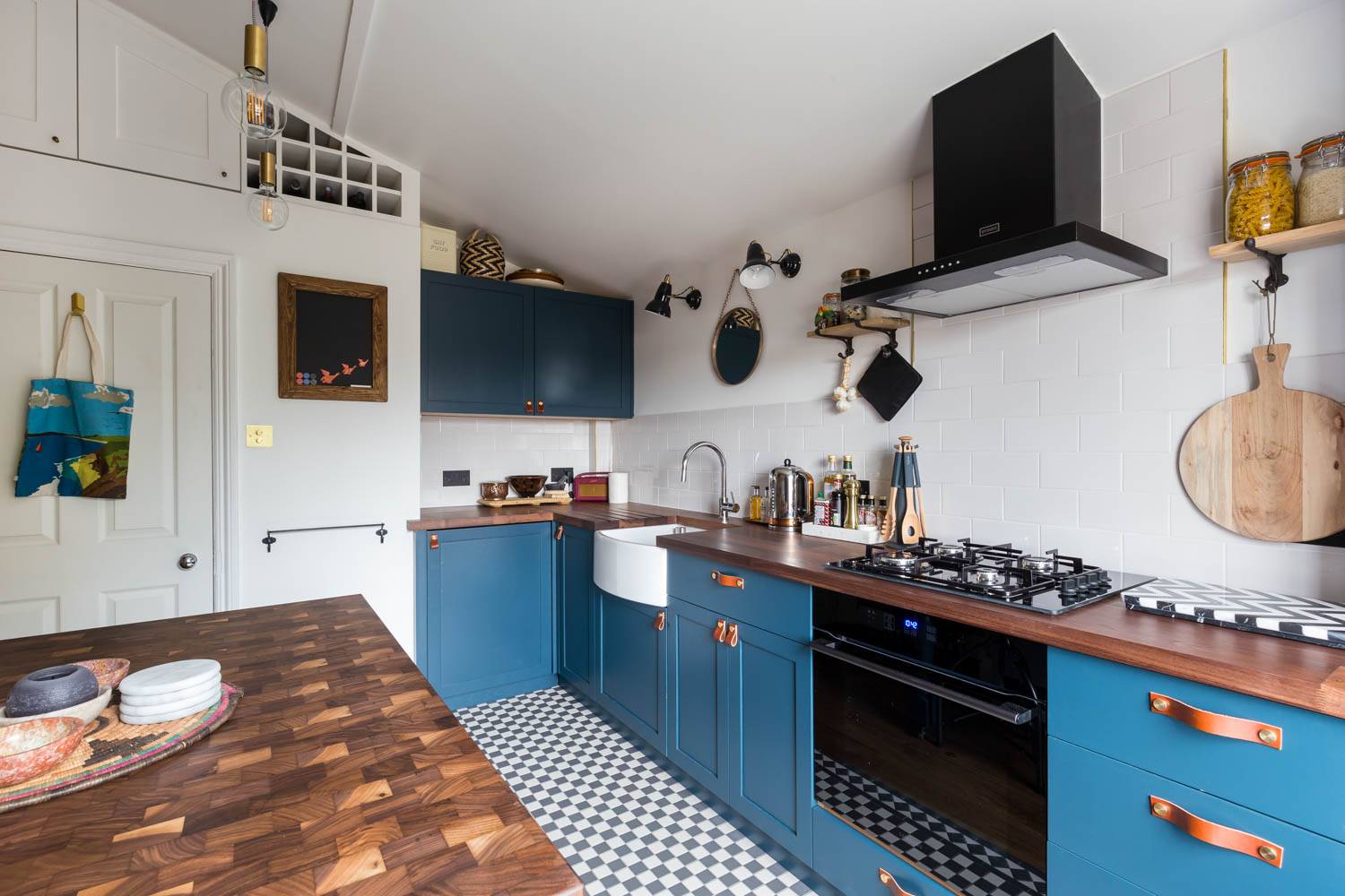
The
Brixton kitchen
combines deep blue with warm walnut tones for a welcoming feel
The combination of deep blues with exposed natural timber colours gives a kitchen a warm and friendly vibe.
The Brixton kitchen, above, features Shaker cabinet doors in Naked Kitchens’ Night Sky blue, along with walnut worktops with end grain surfaces. It’s a lovely balance of painted and natural surfaces, and the leather cabinet handles add texture and visual interest to a comfortable, happy space.
5) Have fun combining different blues for colour contrasts
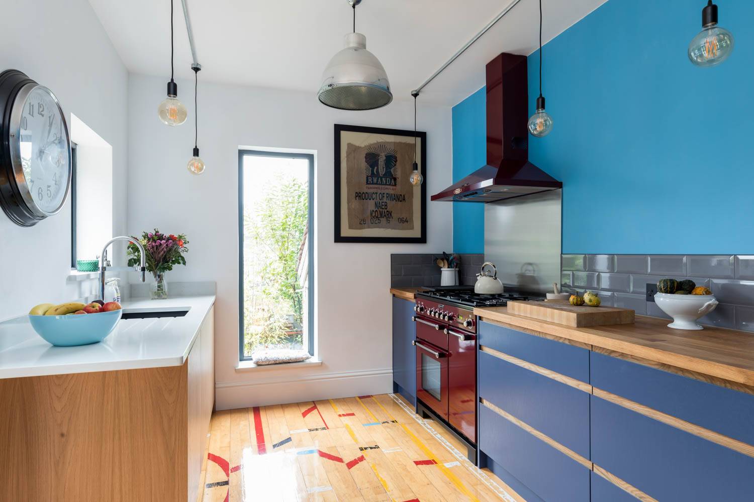
The colourful
Redhill kitchen
with its blue J-Groove and oak doors and cranberry red Rangemaster
Blue is often thought of as a ‘safe’ colour choice, but in fact you can have a lot of fun with it. The Redhill kitchen (above) is a joyous space, including two different custom blues (the cabinets and the feature wall) and a fabulous cranberry red Rangemaster cooker. This striking combination, together with the distinctive restored gym flooring, makes for a really fun, contemporary kitchen.
Feeling inspired? At Naked Kitchens we offer a full colour-matching service; or choose from our own range of gorgeous, durable and environmentally-friendly Naked Colours , which are inspired by the glorious Norfolk coastline and countryside that surround our workshop. Discover more here .
See also
Choosing colours for your kitchen – an expert guide
Green kitchen ideas and inspiration What is a bespoke kitchen?
Image top: the Surrey Malthouse kitchen combines the bold blues of the cabinetry and island with natural oak bar handles, chrome appliances and blue pendant lighting, for a layered, harmonious look
Request a Brochure
To receive a digital copy of our brochure and regular updates from us, please complete your details below.