No products match your search.
Layering Light and Texture: A conversation with designer Stephanie Bailey
Written by Andrew Nixon

A softly layered palette, intelligent storage and just a touch of grown-up whimsy – we speak to designer Stephanie Bailey about the design thinking behind a beautiful townhouse kitchen project...
“Function must always come first – when practicality underpins a design, it simply feels right.”
For Chiswick Townhouse, interior designer Stephanie Bailey of Decorbuddi was tasked with transforming a busy London Edwardian terrace into a calm, hardworking family home. With a background in textile design and a career spanning creative direction roles at brands including Reiss, LK Bennett, Selfridges and Toast, Stephanie brings a refined sensitivity to her interiors. Her approach is deeply client-focused: function comes first, with form, tone and texture layered thoughtfully to create spaces that feel wholly personal.
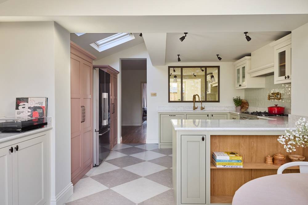
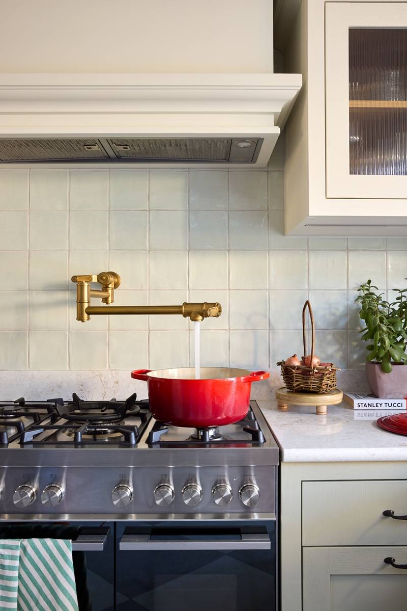
At the heart of the project sits a bespoke in-frame Shaker kitchen by Naked Kitchens, custom-painted in architectural shades from Paint & Paper Library.
We spoke to Stephanie about tonal layering, balancing softness with practicality, and the power of detail…
Let’s start with the Chiswick Townhouse brief. What were the clients hoping to achieve?
The clients wanted a calm, stylish home to support their very full and busy lives. As keen cooks and entertainers, they needed a hard-working kitchen that felt like the heart of the house, alongside a thoughtful reworking of the tricky middle room. Minimising disruption and delivering on time and on budget was essential – this had to be a carefully managed transformation.
The finished kitchen feels calm and fresh, but not flat or minimalist. How did you approach creating a neutral space with character?
Thank you. Kitchens can sometimes feel quite hard – full of voluminous metallic appliances, reflective surfaces and harsh lighting.
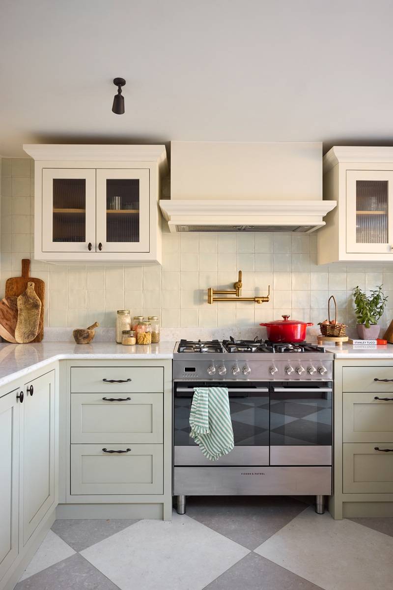
My vision was to create a soft palette of earthy neutrals that would sit beautifully with the garden and southerly aspect. When exploring tone, I became interested in combining different weights of colour. During my research, I came across beautiful food styling images of Neapolitan ice cream, which inspired the use of soothing dusky pink alongside clay greens. The clients are Italian and were married in Tuscany, which certainly helped with the gelato sales pitch!
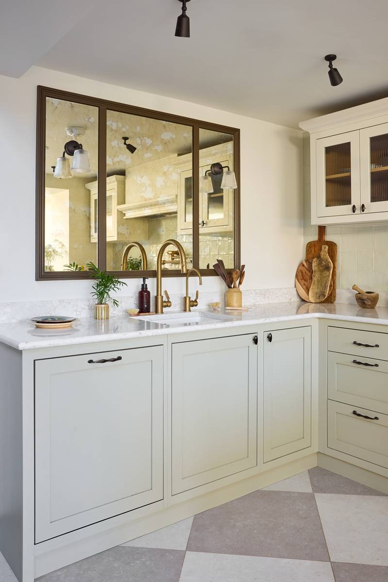
Storage was key, so we incorporated upper cabinets and painted them the same colour as the walls to visually reduce their footprint. As most of the cabinetry sits in the darkest part of the kitchen, combining the palest hue with glass-fronted upper cabinets, bronze ceiling-mounted spotlights and subtly reflective wall tiles and worktops allowed us to bounce light around that zone.
I find that layering colour and texture creates depth. We introduced a mix of metals – bronze, brass and stainless steel – alongside timber to add richness and textural interest, softening the harder materials.
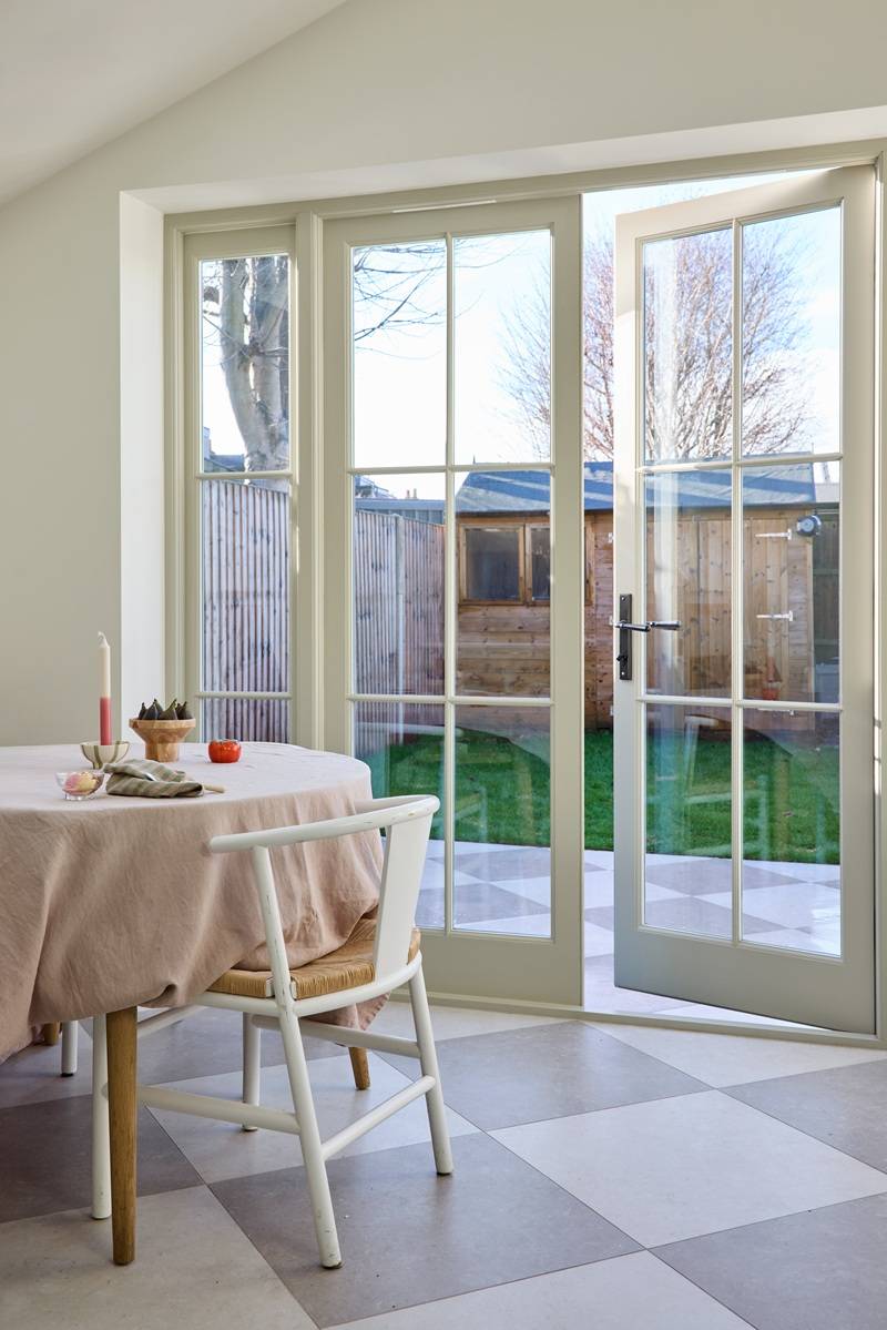
The soft chequered floor adds a touch of youthful whimsy. Laid diagonally, it optically widens the rectangular footprint and flows seamlessly out into the garden.
As we needed to keep the sink facing into the centre of the house, I used the opportunity to design a bistro-inspired, window-style mirror with integrated wall lights. The fluted light shades complement the fluted glass panels on the upper cabinets – repetition is a powerful visual tool.
Additional softness came through mercury-style glass at the splashback – beautiful, forgiving and easy to maintain.
You have a background in textile design and visual direction for brands like Reiss, LK Bennett, Selfridges and Toast. How does that influence the way you think about kitchens and joinery?
In kitchens and joinery, I especially enjoy exploring the use of colours, materials and finishes. I look at wood types, grains, mouldings, glass, stones, metal, fabric – all different types of materials and surface patterns.
This has parallels with textile design and the crossover with my retail work lies in thinking three-dimensionally. In both textiles and interiors, I’m looking for harmony, rhythm, balance and intentional asymmetry.
Space planning is paramount – whether in a kitchen or shopping environment – you have to walk in the footsteps of the user. For me, form must follow function. When practicality underpins a design, it simply feels right. I try to really get to know my clients to ensure I take an empathetic approach.
Function clearly comes first in your process. What were the practical considerations that shaped this layout?
Whenever I’m designing, the first thing I consider is the room’s orientation and natural light; next, how and when the space will be used; and finally, storage requirements and practicalities.
As I got to know my clients, it became clear that they were keen, creative cooks who loved entertaining at home. At the same time, they were navigating busy lives – full-time work, young children and muddy paws. We therefore needed to consider pet care, children’s activities, dining, hosting and audiovisual needs.
The space also needed to transition effortlessly from everyday family life to relaxed entertaining. We carefully zoned the dining and cooking areas so that each function worked independently, while still feeling connected.
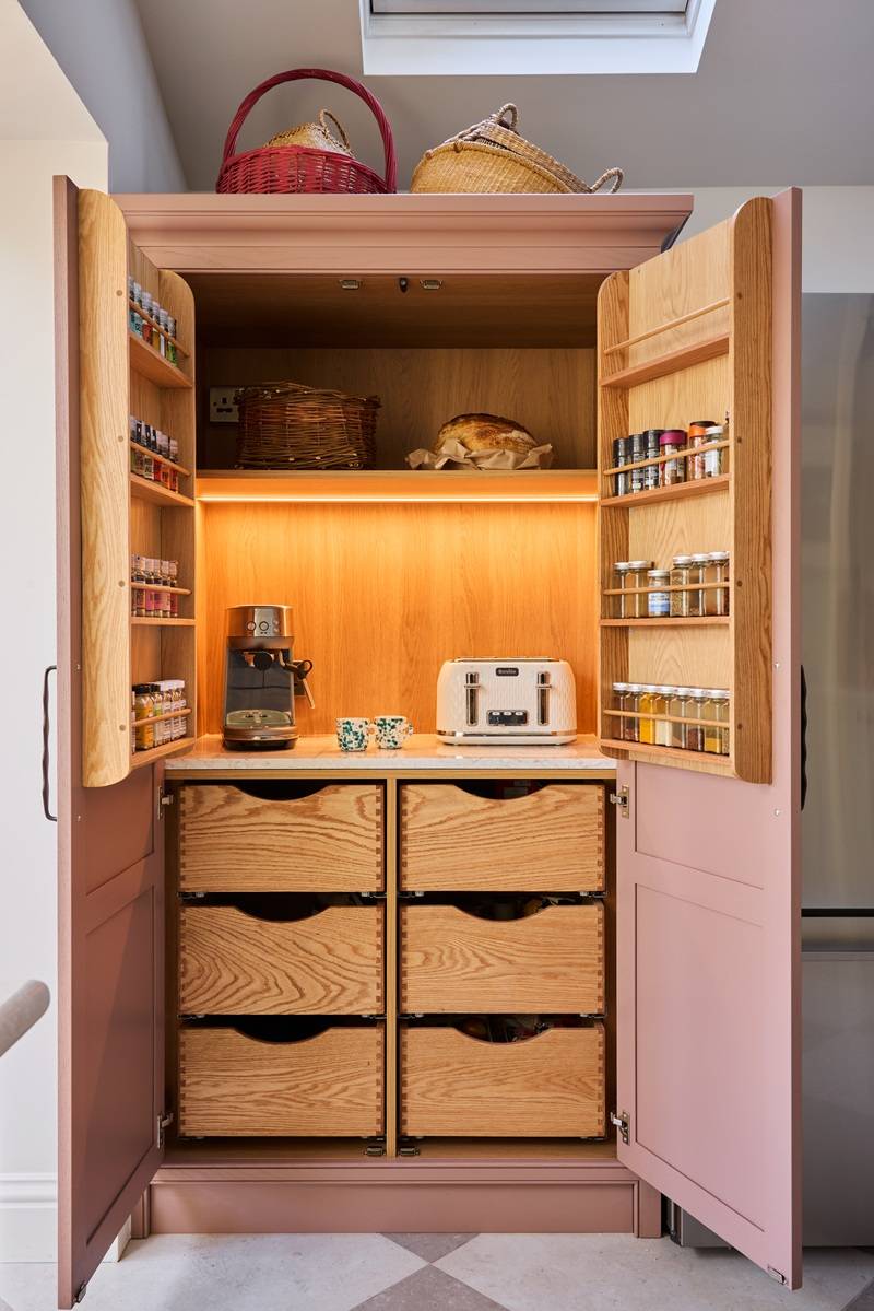
In a London Edwardian terrace, everything must have its place – storage is king. The old adage is never more true: the kitchen really is the beating heart of the home.
The cabinetry uses custom shades from Paint & Paper Library rather than off-the-shelf colours. What drew you to the particular colours for this space?
For me, colour always begins with light. Working closely with the architect and client, we maximised natural light in the new extension through simple skylights and full-width bespoke timber doors to the garden.
In a south-facing room, strong sunlight can soften and bleach colour, so I selected shades with enough depth to hold their character throughout the day. The surrounding garden and brickwork instinctively led me towards a light, earthy clay green.
I particularly value Paint & Paper Library’s architectural range, where colours are organised by tonal weight. These nuanced pairings make it easier to layer shades with subtle variation. By combining the deepest hue with the palest, we achieved a balance between quiet impact and a sense of openness.
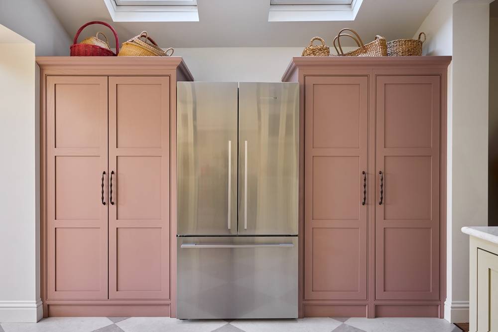
The tall units in Rouge II introduce a soft pink note without overpowering the room. How do you decide when and where to introduce colour?
The kitchen is arranged in three distinct zones, with the tall cabinetry occupying its own defined space. To articulate this area, we chose a moody, dusky pink as the highlight colour.
We wanted the hardworking larder and appliance cupboards to read as freestanding furniture pieces. The muted red-mauve undertone draws out the panel detailing and mouldings, while absorbing light with a sense of understated elegance.
The hardware feels carefully considered. How important are those final details like handles in bringing warmth and personality to a space?
The detail is the design – everything matters. This is a cool, young couple who know what they like.
Let’s face it, family life can be chaotic and messy. By softening the design, the aim was to create a relaxed environment that reflects real life. A touch of grown-up whimsy, a note of playfulness and a mix of metal finishes together soften the overall effect.
When you’re working with a specialist maker like Naked Kitchens, what matters most to you?
Interior design is a broad discipline – we rely on true specialists in every field. Naked are exceptional at what they do. Their design ethos and business values closely align with my own and with the level of service I aim to deliver to clients. Sustainability, intelligent functional detailing, skilled professionals and sensible pricing are all qualities I value highly.
How do you ensure a kitchen feels part of the whole home rather than a standalone project?
A successful project is always considered in the round. When you truly understand your client, the kitchen naturally reflects the broader handwriting of the home.
For this project, I was engaged to design the entire ground floor, which allowed for a more holistic perspective and a cohesive result.
What do you think makes the Chiswick Townhouse project feel personal rather than purely ‘designed’?
There is no template – every project is deeply personal. The success of any design rests on the relationship behind it. Taking the time to build trust, to really understand my clients and to always “think customer” is something that was firmly instilled in me during my years at Selfridges, and remains central to the way I work today.
For someone planning a renovation, what’s one thing you’d encourage them to think about early on?
Live in the space first, if you can. Take time to understand how you truly use it and where its frustrations lie. Be honest about your own limitations and seek expert guidance early – it will save you stress, time and often money. And remember, value doesn’t necessarily equate to price; there will always be someone cheaper, but experience and good judgement are worth investing in.
See more interiors by Stephanie at the Decorbuddi site and @decorbuddi, and follow her on Instagram @stephanie_bailey_decorbuddi
Photography by Kaisa Fiszer
Request a Brochure
To receive a digital copy of our brochure and regular updates from us, please complete your details below.