


 From asparagus fields to coastal sandbanks, each colour in the Naked palette begins with a Norfolk story. Creative Director Jayne Everett reveals the inspiration behind four new additions to the range…
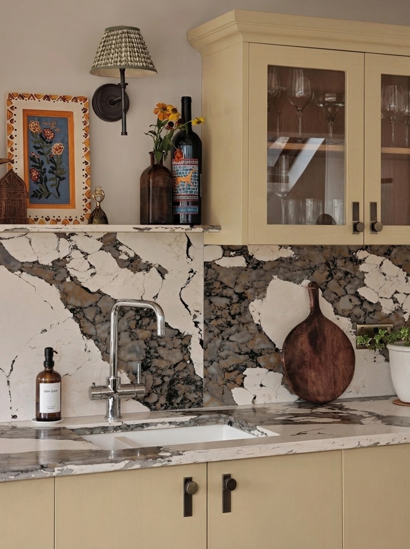
Every so often, a new colour joins the Naked palette. This year we’ve added four: Sharrington Red, Mussel, Asparagus and West Sands.
Each one has a story behind it. And like many of the colours in our range, those stories begin in Norfolk: the countryside and wildlife, the coastlines and the everyday places that surround our workshop.
We asked Naked’s Creative Director Jayne Everett about the inspiration behind each of them…
Asparagus
 Norfolk’s asparagus season is short but memorable, with all those bright green spears appearing in farm shops and roadside stalls for a few weeks each spring. “The herald of the season,” Jayne calls it.
Local growers have a firm deadline. Once the harvest stops, that’s it until the following year, which makes those early summer mornings feel all the more special.
“This hue is a tribute to those days, filling our car boots with the freshest stalks,” Jayne says, “It works across so many different colours. You can combine it with our taupes or our earthy tones and it just sits beautifully.”
 On its own, it’s a warm, confident green, but where it becomes especially interesting is when it’s paired with neighbouring shades. “You might look at two greens individually and think they’re quite similar,” Jayne explains. “But when you combine them, it adds a really gorgeous depth.”
That sort of tonal layering, with slightly lighter and darker shades working together, can bring a kitchen to life in a subtle way.
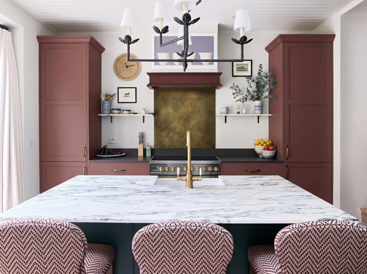
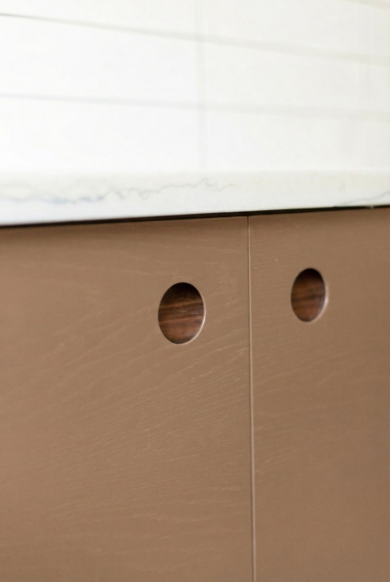
Sharrington Red
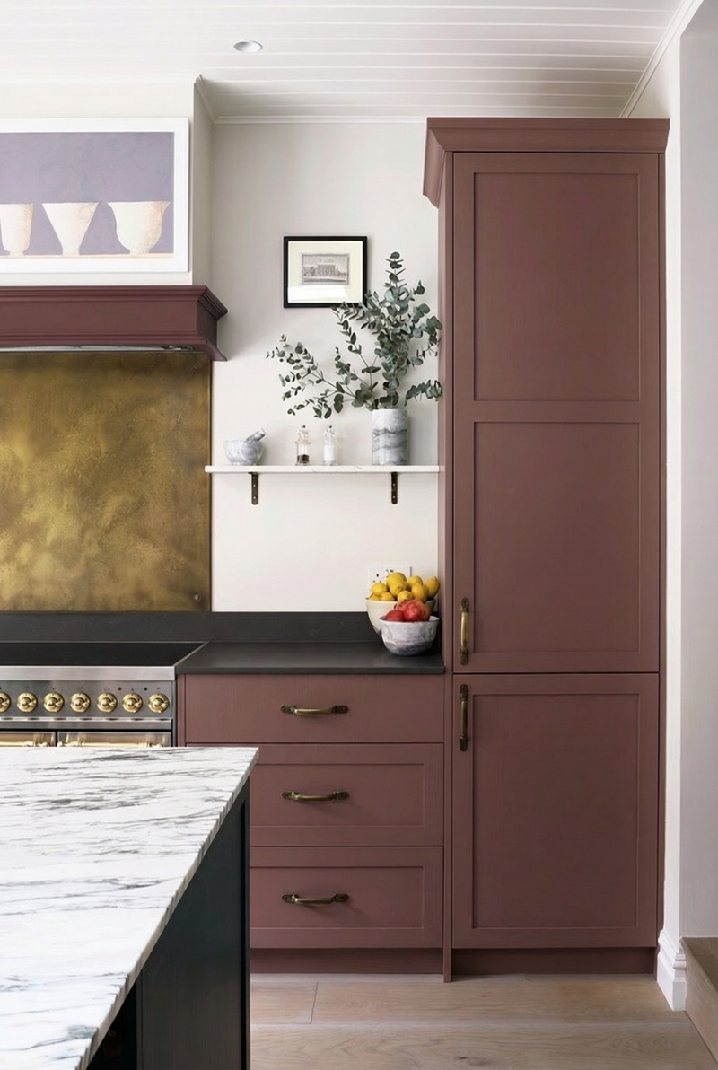 Talking of annual treats, if you live in North Norfolk, chances are you’ve stopped at the Sharrington fruit hut, which has inspired our new red (also pictured top).
“It’s the undisputed home of the berry,” Jayne says. In summer the stall fills with strawberries and raspberries from the Sharrington fruit farm. People pull in, buy a punnet or two, and carry on down the road.
“When you drive past and see all those berries, you think, summer is here!
“Sharrington Red is the sweetness of the harvest – that deep, rich colour you get from perfect strawberries and raspberries.”
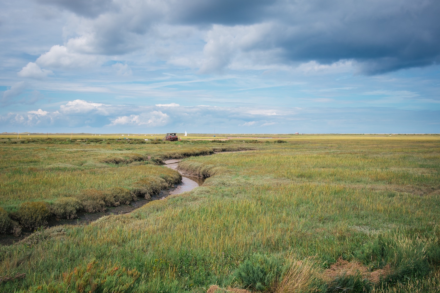
Mussel
 Mussel grew out of the long Norfolk afternoons spent along the coast.
“I think of Brancaster at low tide,” Jayne says. “The mussel beds, the shells, the sea air. It’s quite nostalgic, like the soft glow of a coastal sunset.”
The colour echoes the interior of a mussel shell, with those soft, shifting tones that sit somewhere between pink and muted purple.
 The result is a subtle shade that gently changes with the light. That subtlety means it works easily alongside warmer neutrals such as Holt Latte and Norfolk Dunes, which have become increasingly popular in recent years.
West Sands
 West Sands is named after a place that means a great deal to the Everett family.
Along the Norfolk coast there are stretches of sand that appear and disappear with the tides: places you can only reach when the sea pulls back. West Sands is one of them.
“It’s the sandy colour of West Sands,” Jayne says. “It’s a magical island that appears.”
The colour sits in the yellow family, though it’s softer and more muted than our Swallowtail yellow. (“A bit more buttery,” Jayne explains.)
It’s the sort of shade that feels warm and easy to live with, especially alongside greens, natural timbers and stone, echoing the tones of the Norfolk landscape that inspired it.
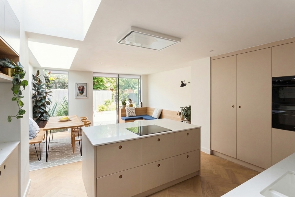
How new colours join the palette
We’re very careful about how and when we add new colours to the Naked palette.
When the design team begins exploring a shade, they spend time looking at how it behaves alongside the rest of the palette: building mood boards, trying combinations and imagining how it might appear across cabinetry and walls.
“It’s collaborative,” Jayne says. “The designers are always looking at interiors and thinking about what colours would be lovely to introduce.”
Often the moment of decision comes when a colour is placed next to others and something just clicks.
“You start putting it with brass, or polished nickel, or our other colours,” Jayne says, “and suddenly you see how beautifully it works.”
Browse all the Naked colours, including the four new tones, and request a custom sample box here.
See also:
From our place to yours – an interview with the Everett family
")
-800x600.webp "Designing a kitchen for busy family life")


-800x600.webp "The most common kitchen layout mistakes (and how to avoid them)")

